From Tableau Desktop you sign in lo a Tableau Server site. What appears in the list of available data sources when you search for a published data source?
A. All the data sources published to the site
B. All the data sources published to the Tableau Server
C. All the data sources published to the site within the folders to which you have access
D. All the data sources published to the Tableau Server within the folders to which you have access
Explanation
When you sign in to a specific Tableau Server site from Tableau Desktop, the list of available published data sources is governed by two main factors: the site boundary and your user permissions. You are restricted to seeing resources (data sources, workbooks, etc.) published only to that particular site. Furthermore, you will only see those resources for which your user account has been granted at least view/connect permission.
✅ Correct Option: C
All the data sources published to the site within the folders to which you have access
This option is correct because it acknowledges both key limitations:
Published to the site:
Tableau Server/Cloud can host multiple independent sites. Signing into one site means you cannot see data sources published to other sites.
To which you have access:
Data source visibility is strictly controlled by permissions. If a data source is published to the site but your user account does not have permission to view or connect to it (often managed at the project/folder level), it will not appear in your search results.
❌ Incorrect Options
A. All the data sources published to the site
This is incorrect because it ignores the crucial factor of permissions. Even if a data source is on the site, you won't see it if you lack the necessary "Connect" or "View" permission for that data source or the folder it resides in.
B. All the data sources published to the Tableau Server
This is incorrect because it ignores the concept of sites. A single Tableau Server instance can host multiple, distinct sites. Signing into Site A does not allow you to see data sources published to Site B.
D. All the data sources published to the Tableau Server within the folders to which you have access
This is incorrect for the same reason as option B: it ignores the site boundary. You are only guaranteed to see resources within the specific site you signed into, regardless of your permissions on other sites within the same physical server.
📖 Reference
Tableau Official Documentation: Permissions and Content Access
Source: Tableau Help: Content Permissions (Search for "Tableau Server data source permissions and visibility" on the official Tableau website)
Note: The official documentation confirms that users only see content on the specific site they are logged into, and content visibility is further restricted by the explicit permissions set on that content.
A Data Analyst has a data source that has two tables named Table1 and Table2. Table1 is the primary table and Table2 is the secondary table.
The analyst wants to combine the tables by using Tableau Prep. The combined table must include only values from Table1 that do not match any values in Table2. The field values from Table2 must appear as null values.
Which type of join should the analyst use?
A. Inner
B. Left only
C. Left
D. Full outer
E. Union
Explanation
The analyst needs to perform an "anti-join" operation, which keeps records from the primary table that have no matching records in the secondary table. In Tableau Prep's join dialog, this is explicitly called a "Left only" join. This join type starts with a Left Join (keeping all records from Table1) and then filters out any records that successfully matched with Table2, leaving only the non-matching rows where all fields from Table2 will be null.
✅ Correct Option
🟢 B. Left only:
This is the specific join type designed for this "anti-join" scenario. It keeps all records from the left table (Table1) that do not have a match in the right table (Table2). For these unmatched records, all columns from Table2 will be populated with null values, exactly as the analyst requires.
❌ Incorrect Options
🔴 A. Inner:
An inner join would return only the records where there is a match between Table1 and Table2. This is the opposite of what is needed, as it would exclude the non-matching records from Table1.
🔴 C. Left:
A standard left join keeps all records from Table1, regardless of whether they match with Table2. Matching records show Table2 data, and non-matching records show nulls. However, this includes both matching and non-matching records, while the requirement is for only the non-matching ones.
🔴 D. Full outer:
A full outer join returns all records from both tables. It will include matching records, non-matching records from Table1, and non-matching records from Table2. This includes much more data than the specified requirement.
🔴 E. Union:
A union is used to stack rows from tables with similar structures on top of each other. It is not a join and cannot be used to horizontally combine tables based on matching keys, making it irrelevant for this scenario.
Summary
A "Left only" join is the precise tool for filtering a primary table to rows that have no corresponding data in a secondary table, resulting in null values for all secondary table fields.
Reference
Tableau Help: Combine Your Data
How should a Data Analyst sort data by Sales across multiple dimensions in Tableau?
A. Use the Sets feature to combine dimensions and then sort one of the fields.
B. Use the Group feature to combine dimensions and then sort the grouped field.
C. Right-click on the rightmost dimension, choose Sort, then select nested in the options.
D. Right-click on each dimension, choose Sort, then select data source order in the options.
Explanation
✅ Correct Answer: C. Right-click on the rightmost dimension, choose Sort, then select nested in the options.
This is the correct approach to sort a measure like Sales across multiple hierarchical dimensions (e.g., Region → Category → Sub-Category). Nested sorting ensures that each lower-level dimension is sorted within the context of higher-level dimensions, maintaining the hierarchy. You apply it by right-clicking the last dimension in the hierarchy → Sort → Field → select Sales → enable Nested sort. This produces an accurate and meaningful order while preserving the group structure.
❌ Option A: Use the Sets feature to combine dimensions and then sort one of the fields.
Sets are mainly used for filtering or creating subsets, not for sorting. They work as binary selections (in/out), which cannot dynamically sort hierarchical data. Using sets would ignore the context of multiple dimensions, making it unsuitable for nested sorting, as it cannot maintain the hierarchical order required to analyze Sales correctly.
❌ Option B: Use the Group feature to combine dimensions and then sort the grouped field.
Groups combine members into broader categories but do not allow sorting by measures. Sorting grouped fields loses the granularity of the original dimensions and cannot preserve hierarchy. This method may hide important variations in lower-level data, producing results that are not analytically meaningful for multi-level sorting.
❌ Option D: Right-click on each dimension, choose Sort, then select data source order in the options.
Sorting by data source preserves the original dataset order and ignores analytical priorities. It does not sort by a measure and fails to respect hierarchical relationships. In multi-dimensional analysis, this approach can lead to inconsistent or confusing views, especially when you need the data sorted by Sales within groups.
📘 Summary:
To sort data by Sales across multiple dimensions, use nested sort on the rightmost dimension. This maintains hierarchy and grouping. Sets, Groups, and data source order do not provide measure-based sorting and cannot properly order hierarchical data.
🔗 Reference:
Tableau Official Docs – Sorting Data
Open the link to Book1 found on the desktop. Open the Histogram worksheet and use the Superstone data source.
Create a histogram on the Quantity field by using bin size of 3.
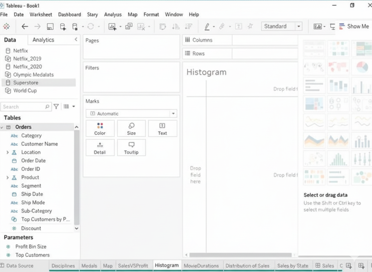
Explanation:
To create a histogram on the Quantity field by using bin size of 3, you need to do the following steps:
➡️ Open the link to Book1 found on the desktop. This will open the Tableau workbook that uses the Superstore data source.
➡️ Click on the Histogram tab at the bottom of the workbook to open the Histogram worksheet. You will see a blank worksheet with no marks.
➡️ Right-click on Quantity in the Measures pane and select Create Bins from the menu. This will open a dialog box that allows you to create bins for the Quantity field. Bins are groups of values that are treated as one unit in a histogram.
➡️ Enter 3 in the Size of bins text box. This will set the bin size to 3, which means that each bin will contain values that are 3 units apart. For example, one bin will contain values from 0 to 2, another bin will contain values from 3 to 5, and so on.
➡️ Click OK to create the bins. You will see a new field named Quantity (bin) in the Measures pane with a # sign next to it.
➡️ Drag Quantity (bin) from the Measures pane to Columns on the worksheet. This will create a histogram that shows the distribution of Quantity by bins. You will see bars that represent the frequency or count of values in each bin.
Optionally, you can adjust the width, color, and labels of the bars by using the options on the Marks card. You can also add filters, tooltips, or annotations to enhance your histogram.
🔗 Reference:
➡️ Create Bins from a Continuous Measures
You are subscribed to several views.
You need to unsubscribe from the views.
What should you use?
A. The My Content area of Tableau web pages
B. The Notifications area of Tableau Prep
C. The Data Source page of Tableau Desktop
D. The Shared with Me page
Explanation:
In Tableau Server or Tableau Cloud, when you are subscribed to views (e.g., workbooks, dashboards, or reports) and wish to unsubscribe, you manage your subscriptions through the My Content area of the Tableau web interface. This section allows you to view and manage all content you own or are subscribed to, including the ability to unsubscribe from views that send you email notifications or scheduled updates.
Here’s how it works:
➡️ Navigate to the My Content page on Tableau Server or Tableau Cloud.
➡️ Locate the Subscriptions section, which lists all the views you are subscribed to.
➡️ Select the view(s) you want to unsubscribe from and choose the option to unsubscribe, typically by clicking an unsubscribe link or button next to the subscription.
This process ensures you no longer receive notifications or scheduled snapshots for those views.
❌ Why the other options are incorrect:
B. The Notifications area of Tableau Prep: Tableau Prep is used for data preparation and transformation, not for managing subscriptions to views. It does not have a notifications area for managing view subscriptions, making this option incorrect.
C. The Data Source page of Tableau Desktop: The Data Source page in Tableau Desktop is used for connecting to and configuring data sources, not for managing subscriptions to views published on Tableau Server or Cloud.
D. The Shared with Me page: The Shared with Me page displays content that others have shared with you, but it is not the primary location for managing subscriptions. While you might see shared views, the unsubscribe action is performed in the My Content area under the subscriptions section.
🔗 Reference:
➡️ Tableau Help Documentation: The Tableau Server/Cloud Help page on “Manage Subscriptions” explicitly states that users can manage their subscriptions (including unsubscribing from views) in the My Content area of the web interface.
➡️ Salesforce Tableau Data Analyst Exam Guide: The “Publish and Manage Content” section (10% of the exam) covers managing content, including subscriptions, on Tableau Server or Cloud. It emphasizes using the My Content area for tasks like unsubscribing from views.
➡️ Trailhead Module: The Tableau Data Analyst Certification Prep Guide (Unit 4: Publish and Manage Content) includes scenarios on managing subscriptions, confirming that the My Content area is used for unsubscribing from views.
You have the following dataset. You want to create a new calculated dimension field named Category that meets the following conditions:
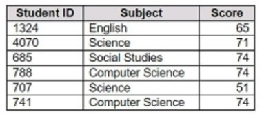
➡️ When Subject is Computer Science or Science, Category must be Sciences.
➡️ When Subject is English or Social Studies, Category must be Humanities.
Which two logical functions achieve the goal? Choose two.
A. IF [Subject]- 'Science' THEN 'Sciences'
ELSEIF [Subject]='English' THEN 'Humanities'
ELSEIF [Subject]-'Social Studies' THEN 'Humanities'
ELSEIF [Subject]= 'Computer Science' THEN 'Sciences'
END
B. IIF(( CONTAINS ([Subject], 'Science') = TRUE) , 'Humanities', 'Sciences')
C. IF ENDSWITH ( [Subject], 'Computer Science') THEN 'Sciences' ELSE 'Humanities' END
D. CASE [Subject]
WHEN 'Computer Science' THEN 'Sciences'
WHEN 'Science' THEN 'Sciences'
WHEN 'English' THEN 'Humanities'
WHEN 'Social Studies' THEN 'Humanities'
End
Explanation
To create a calculated dimension that classifies subjects into Sciences or Humanities, Tableau provides logical functions like IF/ELSEIF and CASE. These allow testing multiple conditions and assigning values accordingly. Using functions that rely solely on string matching (like CONTAINS or ENDSWITH) may not cover all required cases accurately. The goal is to map exact subject names to their corresponding category consistently.
✔️ Correct Options
A. IF / ELSEIF
This function checks each condition in order. It explicitly assigns:
'Science' → Sciences
'Computer Science' → Sciences
'English' or 'Social Studies' → Humanities
This ensures all subjects are mapped correctly. The order of ELSEIF statements allows multiple conditions to be checked sequentially.
D. CASE
The CASE function directly maps exact values of [Subject] to categories:
'Computer Science' & 'Science' → Sciences
'English' & 'Social Studies' → Humanities
It is concise, readable, and avoids errors that can occur with complex nested IF statements.
❌ Incorrect Options
B. IIF with CONTAINS
This checks if the string contains “Science” and then assigns values. However, it incorrectly maps “Science” subjects to Humanities instead of Sciences and cannot handle multiple subjects like Social Studies or English. It is not suitable for exact matching of multiple conditions.
C. IF ENDSWITH
Using ENDSWITH only evaluates whether the subject ends with a specific string. “Science” and “Computer Science” would be handled differently, and English or Social Studies would be incorrectly classified. This method does not fully satisfy the mapping rules.
📎 Reference
Tableau Help – Logical Functions (IF, ELSEIF, CASE)
https://help.tableau.com/current/pro/desktop/en-us/functions_functions.htm
You plan to create a Tableau subscription for several users. Which two formats can you use?
(Choose two)
A. PDF
B. Image
C. Microsoft Excel
D. Microsoft PowerPoint
Explanation:
When you create a subscription in Tableau, you are scheduling a view or dashboard to be automatically sent to one or more users on a regular basis. These subscriptions can be delivered via email, and the content is sent in a non-editable, snapshot format that ensures users see the same version of the data, regardless of their Tableau access level.
As of current Tableau Server and Tableau Cloud functionality:
✅ A. PDF
Tableau supports sending dashboards or views as PDF attachments in subscriptions. This is commonly used for sharing static, printable reports. The PDF preserves formatting and is widely accessible.
➡️ Ideal for executives or stakeholders who prefer printable versions.
➡️ Subscription setup allows choosing PDF as the output format.
🔗 Reference:
Tableau Docs – Subscribe to Views
“When you subscribe to a view, Tableau can send you an image or a PDF of that view.”
✅ B. Image
You can also subscribe users to receive an inline image (PNG) of the view in the email body. This allows users to get a quick glance at the dashboard without opening any attachments.
➡️ Very useful for quick updates.
➡️ The image is generated based on the view as it looks at the time the subscription is triggered.
❌ C. Microsoft Excel
Excel export is not supported as a subscription format. While users can manually export data from a view into Excel (using "Export Crosstab"), this cannot be automated through subscriptions. Excel export is reserved for interactive sessions and on-demand use, not for scheduled delivery.
❌ D. Microsoft PowerPoint
PowerPoint is not a supported subscription format either. While Tableau supports exporting dashboards to PowerPoint manually (via the “Export as PowerPoint” option), it does not allow scheduled delivery of dashboards in PowerPoint format through subscriptions.
You have the Mowing two tables that contains data about the books in a library.
Both tables are incomplete so there are books missing from the tables.
You need to combine the tables. The solution must ensure that all the data is retained.
Which type of join should you use?
A. Full outer join
B. Right join
C. left join
D. Inner join
Explanation:
In this scenario, you are working with two incomplete tables, each containing partial data about books in a library. Since some books exist only in one table and not in the other, and your goal is to retain all data from both tables (no matter where the data resides), you need to use a join that captures everything.
A full outer join is the only join type that ensures:
➡️ All rows from Table A are included
➡️ All rows from Table B are included
➡️ When there's a match on a key (e.g., Book ID), data from both tables is combined
➡️ When there’s no match, rows from one table are still included, with null values for the missing columns from the other
This guarantees nothing is excluded—making it perfect when you’re combining incomplete datasets and need full coverage.
❌ Why other options are incorrect:
B. Right join: Only retains all rows from the right table, and matching rows from the left table. If the left table has unique records, they will be lost.
C. Left join: Retains all rows from the left table, and matching rows from the right. Records unique to the right table are excluded.
D. Inner join: Only includes rows where there is a match in both tables. Any unmatched rows in either table will be dropped—not acceptable if you want full data retention.
📘 Tableau Reference:
"A full outer join combines the results of both left and right outer joins. All records from both tables are included in the result set, with matches where possible and NULLs where no match is found."
🔗 Tableau Docs – Join Types
You want to add a comment to March 2020 as shown in the following visualization.
You have the following sets in a Tableau workbook:
➡️ Top N Customers
➡️ Customers of 2020
➡️ Top N Products
➡️ Sellers of 2020
Which two sets can you combine?
(Choose two)
A. Sellers of 2020
B. Customers of 2020
C. Top N Products
D. Top N Customers
Explanation
To combine sets in Tableau, both sets must be built from the same dimension. This fundamental rule ensures logical compatibility when performing set operations like unions, intersections, or differences. Sets based on different dimensions (e.g., customers vs. products) cannot be combined because they represent fundamentally different data categories with no direct relationship.
✅ Correct Options
Option B: Customers of 2020
This set can combine with Top N Customers because both are derived from the Customer dimension. They share the same member type, allowing logical set operations like finding customers who belong to both groups or comparing their memberships.
Option D: Top N Customers
This set pairs perfectly with Customers of 2020 since they use the same customer dimension. You can create combined sets to analyze relationships between these customer groupings through intersection, union, or exclusion operations.
❌ Incorrect Options
Option A: Sellers of 2020
This set cannot combine with customer-based sets because it uses a Seller dimension. Dimensions must match for set combination, and sellers represent a completely different entity group than customers.
Option C: Top N Products
This product-based set is incompatible with customer sets. Tableau prevents combining sets from different dimensions like products and customers because they lack inherent relationships for meaningful set operations.
📝 Summary
Only sets from identical dimensions can combine. Customer-based sets work together, but cannot merge with product or seller sets due to dimensional mismatch.
🔗 Reference
Tableau Help: "Combine Sets"
You have a line chart on a worksheet.
You want to add a comment to March 2020 as shown in the following visualization.
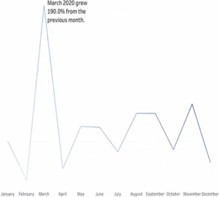
What should you do?
A. Drag the growth rate to Text on the Marks card
B. Enable captions
C. Annotate March 2020
D. Add a tooltip
Explanation:
To add a specific comment to a data point—like March 2020 on a line chart—you use annotations in Tableau. An annotation allows you to call out important events, outliers, or milestones directly on the chart. In this case, you might want to highlight something significant that happened in March 2020 (e.g., a drop in sales due to COVID-19).
To do this:
➡️ Right-click on the data point for March 2020 in the line chart.
➡️ Select "Annotate" → choose "Mark", "Point", or "Area" depending on the context.
➡️ Enter your comment in the annotation box that appears.
This will visually anchor the note to that specific part of the chart, making it clear and informative for viewers.
❌ Why the other options are incorrect:
A. Drag the growth rate to Text on the Marks card: This would display numerical values as labels on the chart, not explanatory comments. It’s for data labeling, not annotation.
B. Enable captions: Captions add a description below the chart for the whole worksheet—not for a specific data point. This wouldn’t help you comment on just March 2020.
D. Add a tooltip: Tooltips appear on hover, not as visible comments on the chart. Also, they don’t persist unless the user interacts with the chart.
📘 Tableau Reference:
"You can annotate a point, an area, or a mark to help explain data in your view."
🔗 Tableau Docs – Annotate Views
You have the following dataset.
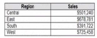
Which Level of Detail (LOD) expression should you use to calculate tie grand total of all the regions?
A. {FIXED: [Region] SUM Sales}
B. {FIXED: SUM Sales}
C. {Fixed: [Region]: TOTAL Sales}
D. {FIXED: TOTAL (Sales)}
Explanation
To show the grand total of Sales across all regions (the same number on every single row), the LOD must ignore every dimension in the view, including Region. The calculation needs to be “fixed” at the highest possible level — the entire dataset — with no dimension declared after FIXED.
Correct Option:
✅ B. {FIXED : SUM([Sales])}
This is the cleanest and most common way to get the overall grand total. Because nothing follows the colon after FIXED, Tableau computes the sum of Sales across the whole data source, ignoring Region, Category, or any other breakdown. The result is the same value repeated on every row — perfect for comparisons or percent-of-total calculations.
Incorrect Options:
❌ A. {FIXED [Region] : SUM([Sales])}
This LOD is fixed at the Region level, meaning it calculates a separate total for each region and repeats that region’s total on its own rows. For example, Central gets Central’s total, East gets East’s total. You end up with four different numbers instead of one single grand total for the entire company.
❌ C. {FIXED [Region] : TOTAL([Sales])}
Two problems here: first, the syntax is wrong because TOTAL() is a table calculation and cannot be used inside an LOD expression like this (Tableau will show an error). Second, even if it worked, scoping to [Region] would still give you per-region totals instead of the dataset-wide grand total you need.
❌ D. {FIXED : TOTAL([Sales])}
This expression is invalid. TOTAL() is a table calculation that operates on the view, not a row-level aggregate like SUM or AVG. Placing TOTAL inside a FIXED LOD causes a syntax error, and Tableau won’t accept it. Even if someone meant to use SUM, the capital “Fixed” (should be lowercase) would still make it fail.
Reference
Tableau Official – Level of Detail Syntax: Create Level of Detail Expressions in Tableau
FIXED LOD examples: FIXED Level of Detail Expressions
Common LOD mistakes (including TOTAL inside LOD): Transform Values with Table Calculations
Open the link to Book1 found on the desktop. Open SalesVSProfit worksheet.
Add a distribution band on Profit to show the standard deviation from- 1 to 1.
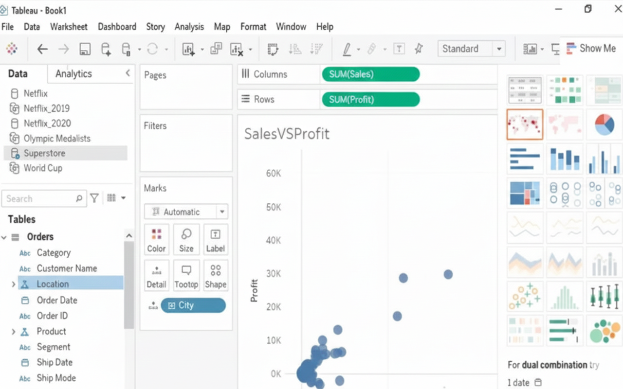
Explanation:
This task involves using the Analytics Pane in Tableau, which contains tools to add statistical overlays without writing complex calculations. The Distribution Band is specifically designed to shade an area based on a statistical model like Standard Deviation. By setting the factors to $\mathbf{-1}$ and $\mathbf{1}$, you are directing Tableau to shade the area that falls between one standard deviation below and one standard deviation above the mean, which represents the core middle portion of the data's distribution. This is a crucial skill for quickly assessing data spread.
✅Correct Steps:
The following steps are required to successfully add the desired distribution band:
➡️ Navigate to the Analytics pane, which is located on the left side of the Tableau workspace next to the Data pane.
➡️ Drag the Distribution Band analytic model from the Analytics pane onto the visualization.
➡️ Drop the Distribution Band on the Profit axis (or the pane, making sure it applies to the measure Profit).
➡️ In the resulting dialog box, select Standard Deviation from the Computation or Value dropdown list.
➡️ In the Factors field, enter the values -1, 1 (separated by a comma or space, depending on the Tableau version) to define the specific range.
➡️ Click OK to apply the distribution band to the Profit axis, visually highlighting the range one standard deviation from the mean.
Reference:
Reference Lines, Bands, Distributions, and Boxes
| Page 1 out of 9 Pages |