A Data Analyst creates a parameter named Choose Region that contains values from a field named Region. The analyst wants users to be able to use the Choose Region parameter to interact with a chart by toggling between different regions.
What should the analyst do next?
A. Add Region to the Filters card.
B. Add the Choose Region parameter to the Pages card.
C. Set the Choose Region parameter to Single Value (list).
D. Add the [Region] = [Choose Region] formula to the Filters card.
Explanation
Creating a parameter alone does not make it interactive with the visualization. To filter the chart based on the parameter selection, you must create a calculated field that compares the [Region] field to the [Choose Region] parameter and then apply this calculation as a filter. This setup allows users to toggle between regions by selecting different values from the parameter control.
✅ Correct Option
D. Add the [Region] = [Choose Region] formula to the Filters card:
This is correct because it creates the necessary link between the parameter and the data. The calculated field [Region] = [Choose Region] returns TRUE for records matching the selected parameter value. When this field is added to the Filters shelf and set to TRUE, it dynamically filters the view to show only the region selected in the parameter control, enabling the intended interactivity.
❌ Incorrect Options
A. Add Region to the Filters card:
While this would filter the data, it creates a static filter based on manually selected region values. It does not connect to the parameter, so users cannot dynamically toggle between regions using the parameter control you created.
B. Add the Choose Region parameter to the Pages card:
The Pages shelf is used for creating animated visualizations that step through different values, not for simple toggle-based filtering. This would create a playback control for animating through regions rather than a simple selector to toggle between them.
C. Set the Choose Region parameter to Single Value (list):
Parameters are typically set to "Single Value (list)" by default when created. This configuration determines how users select values but does not actually connect the parameter to filter the data. This step alone doesn't make the chart interactive.
📝 Summary
To make a parameter control interactive, you must create a calculated field that references the parameter and then apply it as a filter. This creates the dynamic link between user selection and data display.
📚 Reference
Tableau Help: Create Parameters
You create a worksheet named Sales by Region and hide the tide of the worksheet. You print the worksheet as a PDF and notice that the worksheet title appears. You need to prevent the title from appearing when you print the worksheet as a PDF. Which settings should configure from the File menu in Tableau Desktop?
A. Page Setup
B. Print
C. Export As PowerPoint
D. Share
E. Export As Version
Explanation
The Page Setup dialog box in Tableau Desktop controls exactly which elements of a worksheet—including the title, caption, and legends—are included when you print to a physical printer or export to PDF. Even if you hide the title on the worksheet itself (for on-screen viewing), the print settings are configured separately in Page Setup, which defaults to including the title unless explicitly unchecked.
✅ Correct Option: A (Page Setup)
This option, found under the File menu, opens a dialog with a General tab.
The General tab contains checkboxes for elements like Title, View, Caption, and Legends.
To suppress the title in the PDF, you must uncheck the Title box within the Page Setup settings.
❌ Incorrect Option: B (Print)
The Print option (File > Print or File > Print to PDF) is used to execute the printing process after settings have been configured.
The Print dialog box controls the paper size, orientation, and print range (active sheet, entire workbook, etc.), but it does not contain the specific checkboxes to hide individual elements like the title.
❌ Incorrect Option: C (Export As PowerPoint)
This option is used for exporting the view as a slide to a Microsoft PowerPoint presentation.
It is not the correct command for controlling the visibility of elements during a PDF export, and its print-related configuration is entirely separate from the PDF print function.
❌ Incorrect Option: D (Share)
The Share option is typically used for publishing the workbook to Tableau Server or Tableau Cloud, or for sharing via email/other applications.
It has no direct control over the specific elements (like the title) included or excluded when creating a PDF file in Tableau Desktop.
❌ Incorrect Option: E (Export As Version)
Export As Version is used to save the workbook in an older Tableau Desktop file format (e.g., from 2024.1 to 2023.3) for compatibility with other users.
This feature is focused on file format management and has no function related to controlling the visibility of worksheet elements during printing or PDF export.
🔗 Reference
Printing Worksheets
You have a data source that contains the following columns.
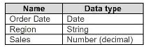
You want to filter regions based on the highest sales. Users must be able to specify the number of regions shown.
Which three actions should you perform in order?
(Place the three correct options in order. Use the arrows to move Options to Answer Area.
Use Answer Area arrows to re-order the options.)
Explanation
You have a data source with columns including Region and Sales. You want to filter regions based on the highest sales, and users must be able to specify the number of regions shown.
Goal: Create a dynamic Top N filter in Tableau.
Steps:
🟢 Step 1 – Create a parameter for “Number of Regions”
✅ Allows users to dynamically set how many regions they want to see (e.g., top 3, top 5).
✅ Parameters act as interactive controls in Tableau for filtering or calculations.
🟢 Step 2 – Create a Top N filter using Sales and the parameter
✅ Filters Region based on highest sales.
✅ The Top N calculation uses the parameter so the filter updates automatically when the parameter value changes.
🟢 Step 3 – Add the filter to the view
✅ Drag the Top N filter to the Filters shelf or apply to the view.
✅ Ensures users can interact with the parameter and dynamically change the number of regions displayed.
Incorrect Approaches Explained:
🔴 Hardcoding the Top N value (e.g., 5) – ❌ Does not allow user interaction.
🔴 Filtering by a static calculated field without using a parameter – ❌ Users cannot control the number of regions dynamically.
🔴 Sorting the view without a Top N filter – ❌ Sorting alone does not limit the number of regions shown.
Summary:
To create a dynamic Top N filter in Tableau, first create a parameter for the number of regions, then use it in a Top N filter based on Sales, and finally add the filter to the view for user interaction. This allows users to see the top regions based on sales and adjust the number displayed.
Reference:
Tableau Official Docs: Top N and Conditional Filters
Tableau Official Docs:
Parameters
A Data Analyst needs to calculate the percent of regional sales that each state contributes to. As a first step, the analyst needs to calculate total sales per region.
Which calculation should the analyst use to do this?
A. {FIXED [Region]: SUM([Sales])}
B. [FIXED [Region]: TOTAL([Sales])]
C. {FIXED [State]: SUM([Sales])}
D. {FIXED [State], [Region]: SUM([Sales])}
Explanation
To calculate each state’s percentage of its region’s total sales, the analyst must first create a calculation that returns the same regional total on every state row. This allows a simple division: State Sales ÷ Region Total. Only a FIXED LOD expression that is scoped exactly to Region (and ignores State) can deliver that consistent regional value across the entire dataset.
Correct Option
✅ A. {FIXED [Region]: SUM([Sales])}
This is the perfect solution. The FIXED keyword tells Tableau to compute the sum of Sales at the Region level only, ignoring any finer dimensions in the view (like State). The result is a single total for the entire region that appears on every state row belonging to that region, making the subsequent percent calculation accurate and straightforward.
Incorrect Options
❌ B. [FIXED [Region]: TOTAL([Sales])]
This syntax is completely invalid and will throw an error immediately. TOTAL() is a table calculation that requires compute-using settings and cannot be placed inside a FIXED LOD expression. Even if someone tries to force it, Tableau will reject the calculation before it ever ever runs.
❌ C. {FIXED [State]: SUM([Sales])}
Although this is valid syntax, it defeats the purpose. By fixing on State, the calculation simply returns the regular SUM([Sales]) for each state—exactly what you already get without any LOD. It provides no regional total at all, so dividing state sales by this value would always yield 100% and make the percentage-of-region analysis impossible.
❌ D. {FIXED [State], [Region]: SUM([Sales])}
This LOD is scoped to the combination of State and Region, meaning it still calculates sales at the individual state level (just with Region as extra context). The result is identical to normal SUM([Sales]) when both dimensions are present, so it never produces a single region-wide total. Using this in the denominator would again return 100% for every state.
Reference
FIXED Level of Detail Expressions
How Level of Detail Expressions Work in Tableau
You publish a dashboard that uses an attract. The extract refreshes every Monday at 10:00.
You need to ensure that the extract also refreshes on the last day of the month at 18:00.
What should you do?
A. From Tableau Desktop, open the Publish Workbook dialog box and configure the schedule.
B. From Tableau Server select the workbook select Refresh Extracts and then add a new extract refresh
C. From Tableau Server. select Schedules find the schedule of the extract, and change the frequency to the Last day of the month
D. From Tableau Server. select Schedules and change the priority of the existing schedule
Explanation
To set a second, specific refresh time for an existing extract on Tableau Server or Tableau Cloud, you must add a new refresh schedule to the published data source or workbook. Each extract can be linked to multiple, independent schedules, allowing for flexible refresh timings like weekly and end-of-month. The "Refresh Extracts" option for the workbook allows the analyst to manage all associated schedules without disrupting the already existing Monday schedule.
Options Analysis
✔️ Correct Option: [C] From Tableau Server, select the workbook, select Refresh Extracts, and then add a new extract refresh.
In the Tableau Server or Cloud interface, when you select a published workbook or data source, the Refresh Extracts option lets you view and manage its assigned schedules. To add the required last day of the month at 18:00 refresh without affecting the existing Monday refresh, you must explicitly add a new schedule that targets the same extract. This is the only way to assign multiple, different schedules.
❌ Incorrect Option: [A] From Tableau Server, select Schedules, find the schedule of the extract, and change the frequency to the last day of the month.
If you were to select the existing schedule (Monday at 10:00) and change its frequency, you would overwrite the Monday refresh. This action would ensure the extract refreshes on the last day of the month, but it would stop the necessary weekly Monday refresh, failing to meet the requirement of having both schedules running.
❌ Incorrect Option: [B] From Tableau Server, select Schedules, and change the priority of the existing schedule.
Changing the priority of an extract refresh schedule affects when it runs relative to other tasks scheduled for the same time, but it does not change the frequency or timing. Adjusting the priority would not add the required last-day-of-the-month refresh and is completely irrelevant to setting a new recurring time.
❌ Incorrect Option: [D] From Tableau Desktop, open the Publish Workbook dialog box and configure the schedule.
While the initial schedule is set during publishing from Tableau Desktop, the management and addition of subsequent schedules must be done directly on Tableau Server/Cloud after the workbook or data source has been published. Re-publishing just to change the schedule is inefficient, and the preferred method for managing schedules is always via the web interface.
Reference 🔗
Tableau Help: Extract Refresh Schedules
A colleague provides you with access to a folder that contains the following files:
• Sates.csv
• Bookl.twb
• Sates.hyper
• Export.mdb
Which He contains an extract?
A. Export mdb
B. Book1.twb
C. Sales.hyper
D. Sales.csv
Explanation
A Tableau extract is a highly compressed, optimized snapshot of data stored locally on your machine. This local copy, which uses Tableau's proprietary high-performance engine, improves visualization speed, reduces the load on the original database, and allows for offline work. Since Tableau version 10.5, the modern file extension for a data extract is .hyper (replacing the older .tde extension).
✅ Correct Option: C. Sales.hyper
The .hyper extension specifically denotes a Tableau Data Extract file. This file type contains the actual data from the source, compressed and stored in a columnar format that is highly optimized for fast querying within Tableau. It functions as an independent, local copy of the data, which is the definition of an extract.
❌ Incorrect Option: A. Export.mdb
The .mdb extension is associated with a Microsoft Access Database file. While Tableau can connect to this file type to access data, the .mdb file itself is the original data source, not a Tableau-created or optimized data extract. It is a proprietary database format separate from Tableau's extract technology.
❌ Incorrect Option: B. Book1.twb
The .twb (Tableau Workbook) extension contains the design and logic of your visualization, such as worksheets, dashboards, and connection information. Crucially, a standard .twb file does not contain the actual underlying data. It requires live access to the original data source (like the .csv or a database).
❌ Incorrect Option: D. Sales.csv
A .csv (Comma Separated Values) file is a plain-text file containing raw data, which serves as a simple data source. Tableau can connect to this file type, but the file itself is the original source of data, not a compressed, optimized Tableau extract file.
🌐 Reference
Tableau File Types and Folders
You have the following tiled dashboard that has one sheet.
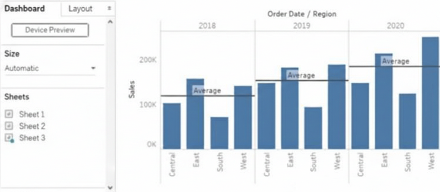
You want to replace the sheet with Sheet2.
What should you do?
A. Right-click Sheet2 and select Add to Dashboard.
B. Select Sheet3 and click the Swap Sheet button next to Sheet2.
C. From the context menu of Sheet3. select Remove Dashboard item
D. Drag Sheet2 to the dashboard.
E. From the context menu of Sheet3. select Deselect
Explanation
In a tiled Tableau dashboard, a sheet can be replaced by dragging another sheet into its tile area. Tableau highlights the target location and automatically swaps the sheet while keeping the existing layout, size, spacing, and formatting intact. This drag-and-drop method avoids deleting objects or adding extra tiles and is the only direct way to replace a sheet without altering the dashboard’s structure.
🟦 Correct Answer: D. 🟦 Drag Sheet2 to the dashboard
Dragging Sheet2 onto the tile where the existing sheet is displayed allows Tableau to immediately replace it while preserving the layout. This method maintains formatting, spacing, borders, and sizing with no extra cleanup or adjustments, making it the most efficient and accurate way to replace a sheet on a tiled dashboard.
🟥 Why the other options are incorrect
A. 🟥 Right-click Sheet2 and select “Add to Dashboard”
This action adds Sheet2 as a new extra tile instead of replacing the existing one. It requires manual removal or rearrangement afterward, causing additional effort and layout disruption.
B. 🟥 Select Sheet3 and click the Swap Sheet button
Tableau dashboards do not contain a swap sheet button. Swapping can only be performed using drag-and-drop. This option refers to a non-existent feature.
C. 🟥 From the context menu of Sheet3, select “Remove Dashboard item”
Removing the item deletes the tile and breaks the layout, forcing you to rebuild spacing and repositioning. It does not replace the existing sheet and adds unnecessary steps.
E. 🟥 From the context menu of Sheet3, select “Deselect”
Deselect does not change dashboard content or layout. It cannot replace, swap, or remove sheets, making it irrelevant to modifying dashboard objects.
🔗 Official Reference
📄 Tableau Help — Create a Dashboard
What should a Data Analyst use to visualize the distribution and variability of measure values along an axis?
A. Bullet Graph
B. Box Plot
C. Scatter Plot
D. Histogram
Explanation
When you need to show how a measure is distributed (spread, central tendency, outliers, skewness) across categories or time, the chart that explicitly displays variability along an axis with clear statistical markers is a box-and-whisker plot.
🟢 Correct Option: B. Box Plot
A Box Plot visually summarizes distribution and variability in one glance:
The box shows the interquartile range (25th to 75th percentile)
The line inside is the median
Whiskers extend to min/max (or 1.5× IQR)
Dots beyond whiskers are outliers
Perfect for comparing variability of a continuous measure (e.g., Sales, Profit, Duration) across categories.
🔴 Incorrect Option: A. Bullet Graph
Bullet graphs are designed for comparing a primary measure against a target and benchmarks (like a gauge alternative). They show performance, not statistical distribution or variability of the underlying data points.
🔴 Incorrect Option: C. Scatter Plot
Scatter plots are excellent for showing relationships or correlation between two continuous measures, or spotting clusters/outliers individually. They do not summarize distribution (median, quartiles, whiskers) in a compact statistical way like a box plot does.
🔴 Incorrect Option: D. Histogram
Histograms show the frequency distribution of a single measure using bins, but they are not placed “along an axis” of categories. They visualize one overall distribution, not side-by-side variability across multiple groups.
Reference:
Tableau Official – Build a Box Plot
You want to connect a Tableau workbook to a dataset in a Microsoft Excel spreadsheet.
What should you do from Tableau Desktop?
A. From the Data menu select New Data Source
B. From the Data menu select Replace Data Source
C. From the File menu select Import Workbook
D. From the File menu select New
Explanation
Connecting a Tableau workbook to an Excel spreadsheet requires establishing a live or extract connection to the file so Tableau can read its sheets, named ranges, or tables. This is always initiated through the dedicated connection workflow in Tableau Desktop, not by opening or importing the workbook itself. Only one menu option starts this process correctly.
Correct Option:
✅ A. From the Data menu select New Data Source
This is the official and only way to add a brand-new Excel file (or any other data source) to your workbook. Choosing Data → New Data Source opens the Connect pane, where you select “Microsoft Excel,” browse to your .xlsx or .xls file, and Tableau instantly previews sheets and connections. You can then join multiple sheets, create relationships, or build extracts.
Incorrect Options:
❌ B. From the Data menu select Replace Data Source
→ Replace Data Source is strictly for swapping an existing connection with another data source that has identical structure (same field names and data types). It cannot be used to introduce a completely new Excel file and will be grayed out if no data source exists yet.
❌ C. From the File menu select Import Workbook
→ There is no “Import Workbook” command in Tableau Desktop. The File menu offers Open, Save, Export as .twbx, etc., but none of these options establish a data connection to an external Excel file.
❌ D. From the File menu select New
→ File → New creates an empty workbook with no data sources attached. While you can add data afterward, this step alone does not connect to Excel—it only clears the current workspace and starts a blank canvas.
Reference:
Tableau Official Help – Connect to Excel: Excel
New vs Replace Data Source (official distinction): Blend Your Data
You have the following chart that shows profits and discounts over time.
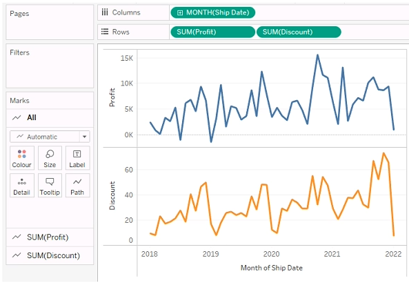
You need to combine the lines to appear as shown in the following chart.
.png)
What should you do?
A. Drag Discount to Color on the Marks card
B. Convert Discount to Discrete
C. Set Discount to Dual Axis
D. Drag Discount to the Columns shelf
Explanation
When you want to show two measures (e.g. Profit and Discount) together on a single chart over time, using a dual-axis is the standard way in Tableau to overlay two independent value lines — each with its own axis, but sharing the same time dimension on the x-axis. This lets each measure keep its own scale (if required) while combining them visually in one view. Other methods won’t properly overlay two continuous measure-lines with separate axes.
Why 🟢 C (Dual Axis) is correct
Setting Discount to Dual Axis ensures both measures (Profit and Discount) draw on the same time-based X-axis but with separate Y-axes. This allows Tableau to overlay the two lines in the same pane, while preserving independent scaling and visual clarity. Once dual axis is applied, you can use the Marks card to ensure each line has its own style/color.
❌ Why the other options are incorrect
🔴 A. Drag Discount to Color on the Marks card
Dragging Discount to color would only change the color encoding of existing marks — it doesn’t add a second measure. You would still have just one measure (e.g. Profit) plotted; Discount would be used merely as a color dimension, not drawn as a separate line. So you won’t get two lines.
🔴 B. Convert Discount to Discrete
Converting Discount to discrete changes how Tableau treats discount values — as categorical, not continuous measures. That won’t cause it to plot Discount as a second continuous measure over time. Instead, it would treat discount as categories, not a meaningful line trend over time. That fails your goal of “combining lines over time.”
🔴 D. Drag Discount to the Columns shelf
Dragging Discount to Columns would create a different chart dimension (e.g. separate columns per discount value) — not overlay Discount as a second measure over time. This restructures the chart, rather than combining measures along the time axis. It is not how you overlay two measures over the same time series.
Summary
To overlay two measures (Profit and Discount) over time in one chart in Tableau, you should use Dual Axis — this overlays the measures with independent axes but a common time dimension. Other approaches (color encoding, discrete conversion, moving to Columns) do not create a proper dual-measure overlay. Dual-axis is the correct, standard method in Tableau for this scenario.
You have a dataset that contains sates data. The following is a sample of the data.
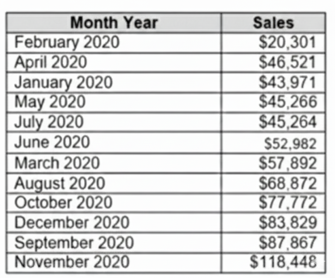
You need to return a value of true if a month has sales greater than $50 000. otherwise the formula must return a value of false.
Which two formulas achieve the goal. Choose two
A. SUM{[Sales]) IN (50000)
B. IIF(SUM< [Sales] )>50000, TRUE, FALSE)
C. MAX< [Sales], 50000)
D. [Sales] > 50000
Explanation:
In Tableau, evaluating whether monthly sales exceed a specific threshold requires a combination of aggregation and logical comparisons. The formula must correctly sum or reference the monthly sales and return a Boolean TRUE or FALSE. Incorrect syntax or using row-level calculations without proper aggregation can lead to errors or inaccurate results. Using the correct approach ensures accurate evaluation across the dataset and meets the exam requirement.
Correct Option – ✔️ B. IIF(SUM([Sales]) > 50000, TRUE, FALSE):
This formula works because it first aggregates all sales for the month using SUM([Sales]) and then evaluates whether the total exceeds 50,000. The IIF function explicitly returns TRUE if the condition is met and FALSE if it is not. This ensures that the formula evaluates the monthly total, not individual rows, making it the most reliable solution for the requirement.
Correct Option – ✔️ D. [Sales] > 50000:
This formula works when [Sales] is already summarized at the monthly level. The expression evaluates to TRUE if the monthly total exceeds 50,000 and FALSE otherwise. While it is simpler than Option B, it depends on the aggregation context. If [Sales] is already aggregated per month, this formula provides a clear and readable way to implement the Boolean logic.
Incorrect Option – ❌ A. SUM{[Sales]) IN (50000):
This formula is invalid in Tableau. The syntax SUM{[Sales]) is incorrect, and the IN operator is used for set membership, not threshold comparisons. Using this formula would produce an error and cannot correctly determine whether monthly sales exceed 50,000.
Incorrect Option – ❌ C. MAX< [Sales], 50000):
This formula is also invalid. Even if rewritten correctly as MAX([Sales]) > 50000, it would check only the largest individual sale in the month rather than the total sales. Because the requirement is to evaluate total monthly sales, this formula would not produce accurate results.
Summary:
The most reliable approach is ✔️ Option B, IIF(SUM([Sales]) > 50000, TRUE, FALSE), because it correctly aggregates sales and evaluates the Boolean condition. Option ✔️ D works only if [Sales] is already aggregated per month. Options ❌ A and ❌ C are either syntactically invalid or logically unsuitable.
Reference:
Tableau Official Documentation – Logical Functions
In a dataset, a Data Analyst has a string field named Category that contains unnecessary trailing spaces.
Which function should the analyst use to remove the trailing spaces from the Category field?
A. RTRIM
B. SPLIT
C. LTRIM
D. REPLACE
Explanation
A Data Analyst must ensure data cleanliness for accurate reporting. Trailing spaces, often invisible, can cause significant issues. They can prevent identical values from being grouped together, disrupt sorting, and cause lookup failures. Using the correct string function to remove these unwanted spaces is therefore a critical data preparation step before any analysis.
✅ Correct Option
A. RTRIM
The RTRIM function (short for "Right Trim") is explicitly designed to remove all trailing whitespace characters from the end of a string.
When applied as RTRIM([Category]), it will clean each field value by stripping spaces only from the right side, leaving leading spaces and internal spaces intact.
This function provides a direct and efficient solution to the specific problem of "unnecessary trailing spaces," ensuring data integrity for operations like grouping and filtering.
❌ Incorrect Options
B. SPLIT
The SPLIT function is used to divide a single string into multiple parts based on a specified delimiter (e.g., a comma, space, or hyphen).
It returns an array of strings and is intended for breaking down structured text data, not for removing whitespace. It does not inherently trim spaces from the ends of the original string.
C. LTRIM
The LTRIM function (short for "Left Trim") is used to remove leading whitespace characters from the beginning of a string.
Using it on a field that only has trailing spaces would be ineffective, as it does not target or affect spaces at the end of the string value.
D. REPLACE
The REPLACE function substitutes every occurrence of a specified substring with another substring.
While technically possible to use REPLACE([Category], " ", "") to remove all spaces, this is a poor practice. It removes every space, including necessary ones between words, which could corrupt the data (e.g., "Customer Service" becomes "CustomerService").
📝 Summary
The RTRIM function is the precise and correct tool for eliminating trailing spaces. LTRIM addresses the opposite end of the string, SPLIT is for segmentation, and REPLACE is an overly broad solution that can damage data.
📚 Reference
Salesforce Tableau Help: String Functions - Official documentation detailing the syntax and usage of RTRIM, LTRIM, SPLIT, and REPLACE.
| Page 3 out of 9 Pages |
| Previous |