Topic 3, Northwind Traders
Case study
This is a case study. Case studies are not timed separately. You can use as much
exam time as you would like to complete each case. However, there may be additional
case studies and sections on this exam. You must manage your time to ensure that you
are able to complete all question included on this exam in the time provided.
To answer the questions included in a case study, you will need to reference information
that is provided in the case study. Case studies might contain exhibits and other resources
that provide more information about the scenario that is described in the case study. Each
question is independent of the other question on this case study.
At the end of this case study, a review screen will appear. This screen allows you to review
your answers and to make changes before you move to the next section of the exam. After
you begin a new section, you cannot return to this section.
To start the case study
To display the first question on this case study, click the Next button. Use the buttons in the
left pane to explore the content of the case study before you answer the questions. Clicking
these buttons displays information such as business requirements, existing environment,
and problem statements. If the case study has an All Information tab, note that the
information displayed is identical to the information displayed on the subsequent tabs.
When you are ready to answer a question, click the Question button to return to the
question.
Overview. General Overview
Northwind Traders is a specialty food import company.
The company recently implemented Power BI to better understand its top customers,
products, and suppliers.
Overview. Business Issues
The sales department relies on the IT department to generate reports in Microsoft SQL
Server Reporting Services (SSRS). The IT department takes too long to generate the
reports and often misunderstands the report requirements.
Existing Environment. Data Sources
Northwind Traders uses the data sources shown in the following table
You need to configure access for the sales department users. The solution must me meet
the security requirements. What should you do?
A.
Add the sales department as a member of the reports workspace
B.
Add the Azure Active Directory group of the sales department as an Admin of the reports workspace.
C.
Distribute an app to the users in the Azure Active Directory group of the sales
department.
D.
Share each report to the Azure Active Directory group of the sales department
Share each report to the Azure Active Directory group of the sales department
Explanation:
This question tests the correct method for granting report access to a group of users (the sales department) while adhering to Power BI's security and governance best practices. The core principle is to manage access centrally and efficiently.
Correct Option:
D. Share each report to the Azure Active Directory group of the sales department.
This is the most secure, manageable, and scalable approach. Sharing reports directly with an Azure AD group ensures access is controlled through centralized group membership. It avoids permission sprawl, simplifies user management (users inherit access via the group), and aligns with the principle of least privilege by granting access only to the specific reports needed, not the entire workspace.
Incorrect Options:
A. Add the sales department as a member of the reports workspace.
Adding users as Members grants them excessive permissions within the workspace (they can modify reports, datasets, and publish content). For consumers who only need to view reports, this violates the principle of least privilege and creates a significant security and governance risk.
B. Add the Azure Active Directory group as an Admin of the reports workspace.
This grants the highest level of permission (Admin), including the ability to delete all content, manage all user access, and modify everything. This is grossly over-permissive for a department that simply needs to view reports.
C. Distribute an app to the users in the Azure Active Directory group.
While distributing an App is an excellent method for broad, read-only distribution, the question states "share each report." Sharing individual reports is more precise when the sales department does not need the entire curated content of a published app, or when different reports might need to be shared with different groups.
Reference:
Microsoft Learn, "Distribute a report or dashboard" and "Roles in workspaces." Best practice dictates using Azure AD groups for sharing to manage permissions efficiently and using the Share function for direct report access, reserving workspace roles for content creators and managers.
You need to design the data model to meet the report requirements.
What should you do in Power BI Desktop?
A.
From Power Query, use a DAX expression to add columns to the Orders table to calculate the calendar quarter of the OrderDate column, the calendar month of the OrderDate column, the calendar quarter of the ShippedDate column, and the calendar
month of the ShippedDate column.
B.
From Power Query, add columns to the Orders table to calculate the calendar quarter and the calendar month of the OrderDate column.
C.
From Power Bl Desktop, use the Auto date/time option when creating the reports.
D.
From Power Query, add a date table. Create an active relationship to the OrderDate
column in the Orders table and an inactive relationship to the ShippedDate column in the
Orders table.
From Power Query, add a date table. Create an active relationship to the OrderDate
column in the Orders table and an inactive relationship to the ShippedDate column in the
Orders table.
Explanation:
The question is about designing a data model to support reporting on dates from the Orders table (like OrderDate and ShippedDate). The requirement implies needing separate analysis by calendar attributes (quarter, month) for at least the order date. The best practice is to create a proper date dimension table.
Correct Option:
D. From Power Query, add a date table. Create an active relationship to the OrderDate column in the Orders table and an inactive relationship to the ShippedDate column in the Orders table.
This is the correct dimensional modeling approach. A dedicated date table provides consistent calendar attributes (year, quarter, month, week) for filtering and grouping. An active relationship to OrderDate allows standard reporting by order date. An inactive relationship to ShippedDate enables time-based analysis on shipping date using the USERELATIONSHIP() function in DAX measures when needed, offering maximum flexibility and performance.
Incorrect Options:
A. From Power Query, use a DAX expression to add columns...
This is incorrect. While possible, adding calculated columns for multiple date attributes directly to the fact table is poor practice. It bloats the fact table, lacks reusability, and doesn't create a proper star schema. Using Power Query (M), not DAX, is the preferred method for such transformations in the data preparation layer.
B. From Power Query, add columns to the Orders table...
This is a partial and suboptimal solution. While using Power Query is correct for transformation, adding columns only for OrderDate ignores the potential need to analyze by ShippedDate. More importantly, it violates star schema design by embedding dimensional attributes in the fact table, which hurts performance and manageability compared to using a separate date dimension.
C. From Power BI Desktop, use the Auto date/time option.
The Auto date/time feature creates hidden date tables, which are not recommended for enterprise models. They increase model size, offer limited customization, and can lead to confusion. Explicitly creating a date table is a core exam objective and a documented best practice.
Reference:
Microsoft Learn, "Model data in Power BI" and "Create date tables in Power BI." Guidance strongly recommends creating a dedicated date table as a best practice for time intelligence. Using active and inactive relationships from a single date table to multiple date columns in a fact table is a standard modeling pattern.
You need to minimize me size of the dataset. The solution must meet the report requirements What should you do?
A. Change lite OrderlD column in the Orders table to the text data type.
B. Filter out discontinued products while importing the Product table.
C. Remove the QuantityPerUnit column from the Products table
D. Group the Categories table by the CategorylD column.
Explanation:
The goal is to reduce the size of the dataset while preserving all reporting requirements. Dataset size is impacted by the number of rows (cardinality) and columns loaded into memory. The optimal strategy removes unnecessary data at import.
Correct Option:
B. Filter out discontinued products while importing the Product table.
This directly reduces the number of rows stored in the model by removing products not needed for active reporting. If reports are only required for active products, filtering out discontinued items during the data import in Power Query is the most effective way to shrink the dataset without losing required information. This decreases memory usage and improves refresh and query performance.
Incorrect Options:
A. Change the OrderID column to text data type.
This would increase the dataset size. Text data types consume significantly more memory than numeric data types (like Integer). Changing a high-cardinality ID column from integer to text would inflate the model size, which is the opposite of the goal.
C. Remove the QuantityPerUnit column from the Products table.
While removing an unused column can reduce size, its impact is minor compared to filtering rows. The question emphasizes meeting "report requirements." If any report needs this column, removing it would break that requirement. Option B (filtering rows) typically offers greater size reduction.
D. Group the Categories table by the CategoryID column.
This is a nonsensical action in the context of minimizing a dataset in Power BI. A GROUP BY operation in Power Query is used for aggregation, not compression. It would likely destroy the dimensional structure of the Categories table, making it unusable for reporting, and is not a valid method for reducing model size.
Reference:
Microsoft Learn guidance on "Performance optimization" and "Data reduction techniques" for Power BI emphasizes filtering rows early in the process (in Power Query) as a primary method for reducing data volume and improving model performance.
You have the line chart shown in the exhibit. (Click the Exhibit tab.)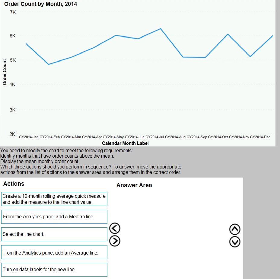
You have an app workspace that contains a dashboard and four reports. All the reports are generated from a single dataset that contains sales data for your company. The reports display the data configured as shown in the following table.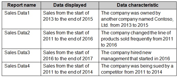
You need to ensure that the users of the reports can locate the correct report by using
natural language queries.
What should you do?
A.
From the properties of the dataset, create four Featured Q&A Questions.
B.
From the Format settings of the reports, modify the Page Information.
C.
From the properties of the dataset, modify the Q&A and Cortana settings.
D.
From the properties of the workspace, modify the Language Settings.
From the properties of the dataset, modify the Q&A and Cortana settings.
Explanation:
The problem is that users need to find one of four specific, similarly named reports ("Sales Data1," etc.) using natural language queries in Q&A. Since the reports differ by time period and underlying business context, users must be able to ask questions like "show sales from 2013 to 2015" and get directed to the correct "Sales Data1" report. This requires enhancing the dataset's semantic model for Q&A.
Correct Option:
C. From the properties of the dataset, modify the Q&A and Cortana settings.
Within the dataset's Q&A and Cortana settings, you can add synonyms, descriptive phrases, and Q&A hints to the underlying tables and fields. You can tailor this so that terms like "Contoso ownership period" or "2013 to 2015 sales" are semantically linked to the "Sales Data1" report's data, guiding Q&A to surface the correct visual or report page when those natural terms are queried.
Incorrect Options:
A. From the properties of the dataset, create four Featured Q&A Questions.
Featured Q&A Questions are pre-written example questions that appear in the Q&A box to guide users. While helpful, they do not fundamentally teach Q&A that "sales from the Contoso era" refers to a specific subset of data. They provide shortcuts but do not enhance the semantic understanding of the data model itself.
B. From the Format settings of the reports, modify the Page Information.
Page Information (like display name and tooltip) helps users in reading a report, but it does not influence how the Q&A engine interprets natural language queries against the underlying dataset. Q&A queries the semantic model, not report page metadata.
D. From the properties of the workspace, modify the Language Settings.
This controls the display language (like English or Spanish) for the workspace interface, not the semantic relationships and synonyms used by the Q&A engine to interpret user queries about specific data contexts.
Reference:
Microsoft Learn: "Improve the quality of Q&A results in Power BI." This documentation explains using Q&A setup at the dataset (semantic model) level to add synonyms, terms, and phrasings, which is essential for mapping business-specific language (e.g., "the lawsuit period") to the correct underlying data.
You have a report that includes a card visualization.
You need to apply the following conditional formatting to the card while minimizing design effort.
For values that are greater than or equal to 100, the font of the data label must be dark red.
For values that are less than 100, the font of the data label must be dark gray.
Which type of format should you use?
A. Color scale
B. Rules
C. Field value
Explanation:
This question focuses on the different ways to apply conditional formatting in Power BI. When you need to change the appearance of a visual based on specific numerical thresholds, you typically use the "FX" button next to a property (like Callout Value color). Field Value formatting is unique because it allows you to delegate the logic to a DAX measure. This approach is highly reusable across multiple visuals and reports, ensuring consistent branding and logic application without manually configuring rules in every instance.
Correct Option:
Option C (Field Value):
This is the correct choice when you want to use a DAX measure to define colors (e.g., using Hex codes or color names). By creating a measure like Color = IF([Value] >= 100, "DarkRed", "DarkGray"), you can apply this logic to the card visual. It minimizes effort by centralizing the logic; if the threshold or colors need to change later, you update the measure once rather than editing every visual’s internal rules.
Incorrect Option:
Option A (Color Scale):
This is incorrect because Color Scales create a gradient or "heatmap" effect. It transitions smoothly between a minimum and maximum value. It is not designed for "hard stops" or binary logic like "above/below 100," making it unsuitable for specific threshold-based color changes.
Option B (Rules):
While Rules are often used for this, Field Value is often considered more scalable for enterprise reports. Rules require manual entry of "Greater than" and "Less than" values within the UI for every visual. If the requirement is to minimize design effort across a complex report, DAX-based Field Values are more efficient.
Reference:
Microsoft Learn: "Conditional formatting in tables, matrices, and cards" describes these options. Rules are the primary method for applying formatting based on thresholds or ranges for the visual's field value itself, which matches this scenario perfectly.
You use an R visual to produce a map of 500,000 customers. You include the values of
CustomerID, Latitude, and Longitude in the fields sent to the visual. Each customer ID is
unique.
In powerbi.com, when users load the visual, they only see some of the customers.
What is the cause of the issue?
A.
The visual was built by using a different version of R.
B.
The data comes from a Microsoft SQL Server source.
C.
The data is deduplicated.
D.
Too many records were sent to the visual.
Too many records were sent to the visual.
Explanation:
R visuals in the Power BI service have a few limitations including:
Data size limitations – data used by the R visual for plotting is limited to 150,000
rows. If more than 150,000 rows are selected, only the top 150,000 rows are used
and a message is displayed on the image. Additionally, the input data has a limit of
250 MB.
Reference:
https://docs.microsoft.com/en-us/power-bi/visuals/service-r-visuals
You have sales data in a star schema that contains four tables named Sales, Customer,
Date, and Product.
The Sales table contains purchase and ship dates.
Most often, you will use the purchase date to analyze the data, but you will analyze the
data by both dates independently and together.
You need to design an imported dataset to support the analysis. The solution must
minimize the model size and the number of queries against the data source.
Which data modeling design should you use?
A.
Use the Auto Date/Time functionality in Microsoft Power BI and do NOT import the Date table.
B.
Duplicate the Date query in Power Query and use active relationships between both Date tables.
C.
On the Date table, use a reference query in Power Query and create active relationships between Sales and both Date tables in the modeling view.
D.
Create an active relationship between Sales and Date for the purchase date and an
inactive relationship for the ship date
Create an active relationship between Sales and Date for the purchase date and an
inactive relationship for the ship date
Explanation:
Only one relationship can be active.
Note: If you query two or more tables at the same time, when the data is loaded, Power BI
Desktop attempts to find and create relationships for you. The relationship options
Cardinality, Cross filter direction, and Make this relationship active are automatically set.
Reference:
https://docs.microsoft.com/en-us/power-bi/transform-model/desktop-create-and-managerelationships
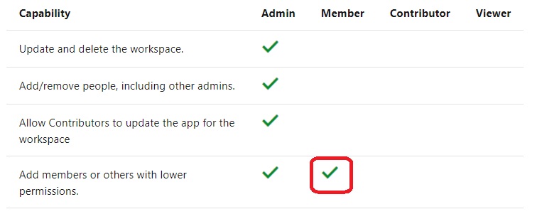
You need to provide a user with the ability to add members to a workspace. The solution must use the
principle of least privilege.
Which role should you assign to the user?
A.
Viewer
B.
Contributor
C.
Member
D.
Admin
Member
You plan to develop a Power BI report that has a bar chart to display the number of
customers by location. You have a table named Customer that has the following columns:
• Customer ID
• CustomerName
• Address
• City
• ProvState
• Country
You need to allow users to drill down by location. The report will display the number of
each customer by Country, and drill down to ProvState, and then to City. How should you
configure the drill down in the bar chart?
A.
In the Value field, add Country. In the Legend field, add ProvState at the top, followed by City.
B.
In the Legend field, add Country. In the Axis field, add ProvState at the top, followed by City.
C.
In the Axis field, add Country at the top, followed by ProvState, and then City.
D.
In the Value field, add Country at the top, followed by ProvState, and then City.
In the Axis field, add Country at the top, followed by ProvState, and then City.
Explanation: References:
https://docs.microsoft.com/en-us/power-bi/guided-learning/visualizations#step-18
https://docs.microsoft.com/en-us/power-bi/power-bi-visualization-drill-down
Your organization has a team of power users who recently created 20 Power BI
dashboards.
The power users share the dashboards with other users in the organization.
When the users attempt to access the dashboards, they receive the error message shown
in the exhibit. (Click the Exhibit.)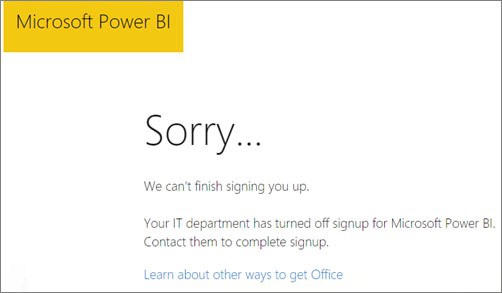
What should you do first?
A.
From the Microsoft Office 365 Admin center, and the Power BI (free) subscription, and then assign a license to each user.
B.
From the Power BI Admin portal, modify the Privacy Settings.
C.
From the properties of each dashboard, modify the Share dashboard settings.
D.
Instruct each user to install Microsoft Office 2016.
From the Microsoft Office 365 Admin center, and the Power BI (free) subscription, and then assign a license to each user.
Explanation:
References: http://www.nubo.eu/en/blog/2016/12/Enable-PowerBI-On-Office-365/
Note: This question is part of a series of questions that use the same scenario. For your convenience, the scenario is repeated in each question. Each question
presents a different goal and answer choices, but the text of the scenario is the
same in each question in this series.
You have a Microsoft SQL Server database that contains the following tables.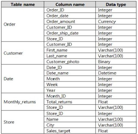
The following columns contain date information:
- Date[Month] in the mm
yyyy format
- Date[Date_ID] in the ddmmyyyy format
- Date[Date_name] in the mm/dd/yyyy format
- Monthly_returns[Month_ID] in the mmyyyy format
The Order table contains more than one million rows.
The Store table has a relationship to the Monthly_returns table on the Store_ID column.
This is the only relationship between the tables.
You plan to use Power BI Desktop to create an analytics solution for the data.
You need to create a relationship between the Order table and the Store table on the
Store_ID column.
What should you do before you create the relationship?
A.
In the Order table query, use the Table.TrasformRows function.
B.
In the Store table query, use the Table.TrasformRows function.
C.
In the Store table query, use the Table.TrasformColumnTypes function.
D.
In the Order table query, use the Table.TrasformColumnTypes function.
In the Store table query, use the Table.TrasformColumnTypes function.
| Page 3 out of 25 Pages |
| Previous |