Topic 2, Contoso Ltd, Case Study
Overview
This is a case study. Case studies are not timed separately. You can use as much exam
time as you would like to complete each case. However, there may be additional case
studies and sections on this exam. You must manage your time to ensure that you are able
to complete all questions included on this exam in the time provided.
To answer the questions included in a case study, you will need to reference information
that is provided in the case study. Case studies might contain exhibits and other resources
that provide more information about the scenario that is described in the case study. Each
question is independent of the other questions in this case study.
At the end of this case study, a review screen will appear. This screen allows you to review
your answers and to make changes before you move to the next section of the exam. After
you begin a new section, you cannot return to this section.
To start the case study
To display the first question in this case study, click the Next button. Use the buttons in the
left pane to explore the content of the case study before you answer the questions. Clicking
these buttons displays information such as business requirements, existing environment
and problem statements. If the case study has an All Information tab, note that the
information displayed is identical to the information displayed on the subsequent tabs.
When you are ready to answer a question, click the Question button to return to the
question.
Existing Environment
Contoso, Ltd. is a manufacturing company that produces outdoor equipment Contoso has
quarterly board meetings for which financial analysts manually prepare Microsoft Excel
reports, including profit and loss statements for each of the company's four business units,
a company balance sheet, and net income projections for the next quarter.
Data and Sources
Data for the reports comes from three sources. Detailed revenue, cost and expense data
comes from an Azure SQL database. Summary balance sheet data comes from Microsoft
Dynamics 365 Business Central. The balance sheet data is not related to the profit and
loss results, other than they both relate to dates.
Monthly revenue and expense projections for the next quarter come from a Microsoft
SharePoint Online list. Quarterly projections relate to the profit and loss results by using the
following shared dimensions: date, business unit, department, and product category.
Net Income Projection Data
Net income projection data is stored in a SharePoint Online list named Projections in the
format shown in the following table.
Which two types of visualizations can be used in the balance sheet reports to meet the reporting goals? Each correct answer presents part of the solution. NOTE: Each correct selection is worth one point.
A. a line chart that shows balances by quarter filtered to account categories that are longterm liabilities.
B. a clustered column chart that shows balances by date (x-axis) and account category (legend) without filters.
C. a clustered column chart that shows balances by quarter filtered to account categories that are long-term liabilities.
D. a pie chart that shows balances by account category without filters.
E. a ribbon chart that shows balances by quarter and accounts in the legend
Explanation:
The reporting goal for a balance sheet analysis, especially concerning long-term liabilities, is to show trends over time. Stakeholders need to see how these specific account balances have changed from one period to the next (e.g., quarter-to-quarter) to analyze debt repayment schedules, financial health, and leverage.
Let's analyze why these two visualizations are effective and why the others are not optimal for this specific goal.
Options A and C are Correct:
Both of these visualizations share the two critical components needed to meet the reporting goal:
They are filtered to the specific account categories of interest:
"long-term liabilities." This focuses the analysis on the relevant data.
They show data by quarter:
This provides the necessary time-series analysis to observe trends, increases, decreases, and patterns over multiple periods.
A. Line Chart:
This is the ideal visualization for showing trends over time. The connecting lines make it easy for the eye to follow the progression of each account category's balance across quarters.
C. Clustered Column Chart:
This is also very effective for comparing the values of different long-term liability accounts side-by-side for each quarter and for seeing the changes from one quarter to the next.
Why the Other Options Are Incorrect:
B. a clustered column chart that shows balances by date and account category without filters.
Incorrect: Showing the entire, unfiltered balance sheet (all assets, liabilities, and equity) in a single column chart by date would be far too cluttered and complex. It would be impossible to extract meaningful insights about long-term liabilities specifically. The lack of filtering makes this visualization unsuitable for the focused reporting goal.
D. a pie chart that shows balances by account category without filters.
Incorrect:A pie chart shows the proportion of parts to a whole at a single point in time. It is completely static and cannot show trends or changes over multiple quarters. It also suffers from the same problem as option B—it shows the entire balance sheet without focus, making it difficult to analyze the specific component of long-term liabilities.
E. a ribbon chart that shows balances by quarter and accounts in the legend.
Incorrect: While a ribbon chart can show data over time, its primary strength is illustrating how the ranking of categories changes. It is excellent for seeing which category is the "top" category in each period. For balance sheet amounts, the focus is on the absolute value and trend of specific accounts (like long-term liabilities), not on their changing rank against other accounts like cash or equity. It is a less effective and more specialized choice compared to a standard line or column chart for this scenario.
Reference:
Core Concept:
This question tests the knowledge of selecting appropriate visualizations based on the analytical goal. The key concepts are:
Time-series analysis requires visuals that show data across a time axis (e.g., Line Charts, Column Charts).
Filtering and Focus is necessary to avoid clutter and present clear, actionable insights for a specific business question.
You need to calculate the last day of the month in the balance sheet data to ensure that you can relate the balance sheet data to the Date table. Which type of calculation and which formula should you use? To answer, select the appropriate options in the answer area. NOTE: Each correct selection is worth one point.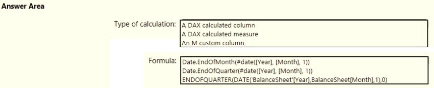
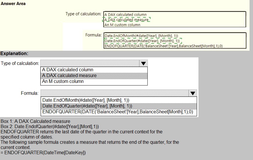
How should you distribute the reports to the board? To answer, select the appropriate
options in the answer area.
NOTE: Each correct selection is worth one point.
What is the minimum number of datasets and storage modes required to support the reports?
A. two imported datasets
B. a single DirectQuery dataset
C. two DirectQuery datasets
D. a single imported dataset
📘 Explanation:
Power BI supports combining data from multiple sources into a single imported dataset, which is the most efficient and flexible approach for report development. Import mode allows:
Integration of data from multiple tables and sources
Fast performance due to in-memory storage
Full support for modeling, DAX, and visuals
You do not need multiple datasets unless there are strict isolation or access control requirements. A single imported dataset can handle all reporting needs if properly modeled.
Reference:
🔗 Microsoft Learn – Understand dataset storage modes
🔗 Microsoft Fabric Community – Minimum number of datasets and storage mode
❌ Why other options are incorrect:
A. Two imported datasets
→ Unnecessary duplication. One well-designed dataset is sufficient.
B. A single DirectQuery dataset
→ Slower performance, limited modeling capabilities, and depends on source system availability.
C. Two DirectQuery datasets
→ Adds complexity and latency. Not needed unless source systems must remain live and isolated.
📘 Summary:
Use a single imported dataset to support multiple reports efficiently. It offers the best performance, flexibility, and simplicity for most reporting scenarios.
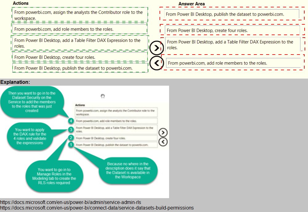
Once the profit and loss dataset is created, which four actions should you perform in
sequence to ensure that the business unit analysts see the appropriate profit and loss
data? To answer, move the appropriate actions from the list of actions to the answer area
and arrange them in the correct order.
You need to create a solution to meet the notification requirements of the warehouse
shipping department.
What should you do? To answer, select the appropriate options in the answer area.
NOTE: Each correct select is worth one point:

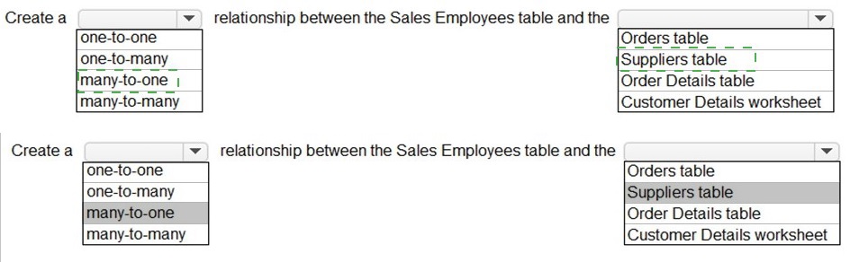
You need to design the data model and the relationships for the Customer Details
worksheet and the Orders table by using Power BI. The solution must meet the report requirements. For each of the following statement, select Yes if the statement is true, Otherwise, select No. NOTE: Each correct selection is worth one point.

You need to create the dataset. Which dataset mode should you use?
A. DirectQuery
B. Import
C. Live connection
D. Composite
Explanation:
The scenario requires creating a dataset from multiple data sources (Excel worksheet, SQL Server table, and a CSV file) that need to be combined and shaped in Power Query before being loaded into the data model. The Import mode is the only one that supports this specific multi-source data mashup and transformation requirement.
Let's analyze why Import mode is the correct choice and why the other modes are not suitable:
Why Option B (Import) is Correct:
Multi-Source Data Mashup:
The Import mode allows you to connect to all three data sources (Excel, SQL Server, CSV) within Power Query Editor, perform necessary transformations (cleaning, merging, appending, calculated columns), and then load the final, integrated dataset into Power BI's in-memory engine (VertiPaq). This is the primary use case for Import mode.
Full Power Query Capabilities:
You have access to the complete set of data transformation tools in Power Query when using Import mode, which is essential for preparing the data from these disparate sources.
Performance:
Once loaded, reports and dashboards are extremely fast because they query the highly optimized, in-memory data model.
Why the Other Options Are Incorrect:
A. DirectQuery:
This mode does not load data into the model. Instead, it sends queries directly to the source database at report runtime. It is designed for a single, supported relational source (like the SQL Server table) and does not support combining data from multiple different source types (like Excel and CSV) into a single model. Power Query transformations are also severely limited in DirectQuery mode.
C. Live connection:
This mode is used to connect to an analysis services model (either Power BI Premium datasets, Azure Analysis Services, or SQL Server Analysis Services). It is not used to create a new dataset from raw source files and a database table. You connect live to an already-built semantic model.
D. Composite:
A composite model blends Import and DirectQuery modes. You might use this if, for example, you imported the Excel and CSV data but kept a very large SQL Server table in DirectQuery. While technically possible, it adds unnecessary complexity. The straightforward and most efficient solution for combining these three relatively small data sources is to use Import mode, which is the default and recommended approach for this scenario.
Reference:
Core Concept:
This question tests the understanding of dataset storage modes in Power BI and selecting the correct mode based on data source types and transformation requirements.
You need to create a relationship in the dataset for RLS.
What should you do? To answer, select the appropriate options in the answer area. NOTE: Each correct selection is worth one point.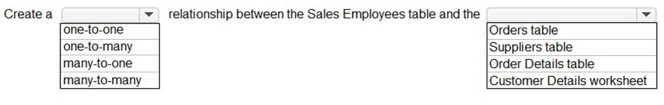
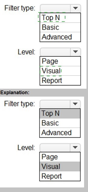
You need to create the Top Customers report.
Which type of filter should you use, and at which level should you apply the filter? To answer, select the appropriate options in the answer area.
NOTE: Each correct selection is worth one point.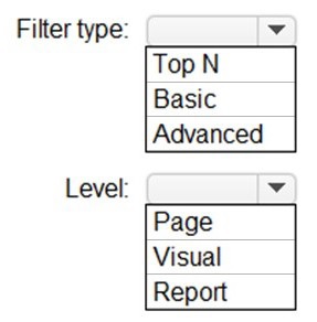
You need to create the On-Time Shipping report. The report must include a visualization that shows the percentage of late orders.
Which type of visualization should you create?
A.
bar chart
B.
scatterplot
C.
pie chart
bar chart
Explanation:
The requirement is to visualize a single, clear metric: the percentage of late orders. This is a part-to-whole comparison, showing the proportion of late orders against on-time orders. The goal is immediate clarity for a key performance indicator (KPI).
Correct Option:
A. Bar Chart
A bar chart is the optimal choice. You can create a clustered column chart with two bars: one for "Late Orders (%)" and one for "On-Time Orders (%)". This allows for a direct, side-by-side comparison of the two complementary percentages, making the late order rate immediately obvious and easy to compare over time if categories like months are added to the axis.
Incorrect Options:
B. Scatterplot
A scatter plot is used to show the relationship between two numerical variables (e.g., order value vs. shipping cost) for many data points. It is ineffective for displaying a single aggregated percentage value and does not clearly communicate a part-to-whole relationship.
C. Pie Chart
While a pie chart can show a part-to-whole relationship, it is less effective for precise comparison than a bar chart. For a critical business metric like late order percentage, a bar chart provides a more accurate and impactful visual comparison, especially when the goal is to track this percentage over different time periods.
Reference:
Microsoft's data visualization best practices often recommend using bar/column charts over pie charts for comparing magnitudes, as the human eye judges length more accurately than angle or area. A bar chart is the standard for clear comparison of categorical data like this.
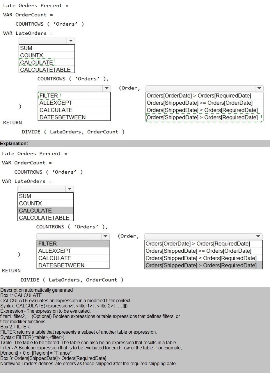
You need to create a measure that will return the percentage of late orders.
How should you complete the DAX expression? To answer, select the appropriate options
in the answer area.
NOTE: Each correct selection is worth one point.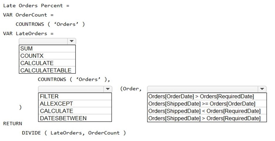
| Page 2 out of 25 Pages |
| Previous |