Topic 4, Misc. Questions
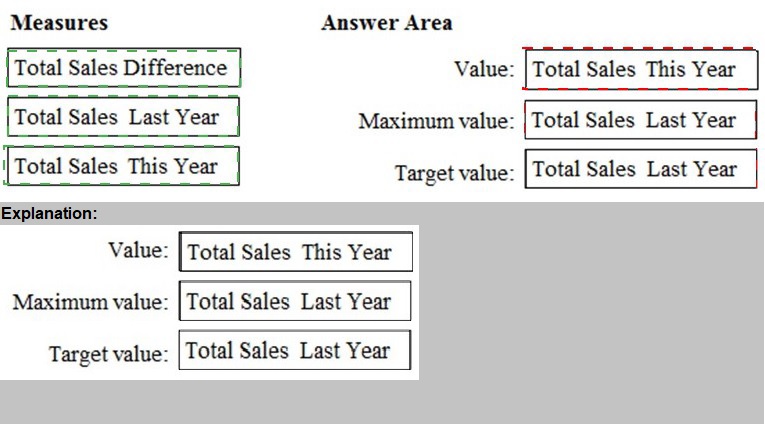
You have a Power BI model that contains a table named Sales. Sales has the following
three measures:
A measure named Total Sales Last Year that displays the sales from the previous
calendar year. The current value is 32.89 million.
A measure named Total Sales This Year that displays the sales from the current
calendar year. The current value is 11.69 million.
A measure named Total Sales Difference that uses a DAX formula of Sales[Last
Year] – Sales[This Year].
You need to create the following visualization.
You need to create a visualization that compares revenue and cost over time.
Which type of visualization should you use?
A.
stacked area chart
B.
donut chart
C.
line chart
D.
waterfall chart
line chart
Explanation:
A line chart or line graph displays the evolution of one or several numeric variables. Data
points are connected by straight line segments. A line chart is often used to visualize a
trend in data over intervals of time – a time series – thus the line is often drawn
chronologically.
Example:
Note: This question is part of a series of questions that present the same scenario.
Each question in the series contains a unique solution that might meet the stated
goals. Some question sets might have more than one correct solution, while others
might not have a correct solution.
After you answer a question in this section, you will NOT be able to return to it. As a
result, these questions will not appear in the review screen.
You are modeling data by using Microsoft Power BI. Part of the data model is a large
Microsoft SQL Server table named Order that has more than 100 million records.
During the development process, you need to import a sample of the data from the Order
table.
Solution: You add a WHERE clause to the SQL statement.
Does this meet the goal?
A.
Yes
B.
No
Yes
Explanation:
The WHERE clause has its effects before the data is imported.
Reference:
https://docs.microsoft.com/en-us/power-bi/connect-data/service-gateway-sql-tutorial
Note: This question is part of a series of questions that present the same scenario. Each
question in the series contains a unique solution that might meet the stated goals. Some
question sets might have more than one correct solution, while others might not have a
correct solution.
After you answer a question in this section, you will NOT be able to return to it. As a result,
these questions will not appear in the review screen.
You have a Microsoft Excel workbook that is saved to Microsoft SharePoint Online. The
workbook contains several Power View sheets.
You need to recreate the Power View sheets as reports in the Power Bl service.
Solution: Copy the workbook to Microsoft OneDrive for Business. From Excel, click Publish
to Power Bl, and then click Upload
Does this meet the goal?
A.
Yes
B.
No
No
You plan to create the chart shown in the following exhibit.
How should you create the dashed horizontal line denoting the 40th percentile of daily
sales for the period shown?
A.
Create a horizontal line that has a fixed value of 24,000.
B.
Add a measure to the visual that uses the following DAX expression.
Heasurel - PERCENTUEX.EXC (Sales,Sales[Total Sales],©.40)
C.
Add a new percentile line that uses Total Sales as the measure and 40% as the
percentile.
D.
Add a measure to the visual that uses the following DAX expression.
Heasurel = PERCENTILEX.INC (Sales,Sales[Total Sales],6.40)
Add a new percentile line that uses Total Sales as the measure and 40% as the
percentile.
Explanation:
The analytics feature enables you to show percentiles across groups specified along a
specific axis.
Example:
1. Click on the analytics tab
2. Select Percentile
3. You can choose a specific percentile along with other formatting options.
4. Drag a date or non-numeric dimension into the Axis of a column chart
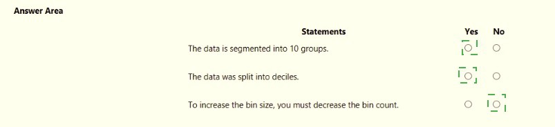
You are creating a column chart visualization.
You configure groups as shown in the Groups exhibit. {Click the Groups tab.)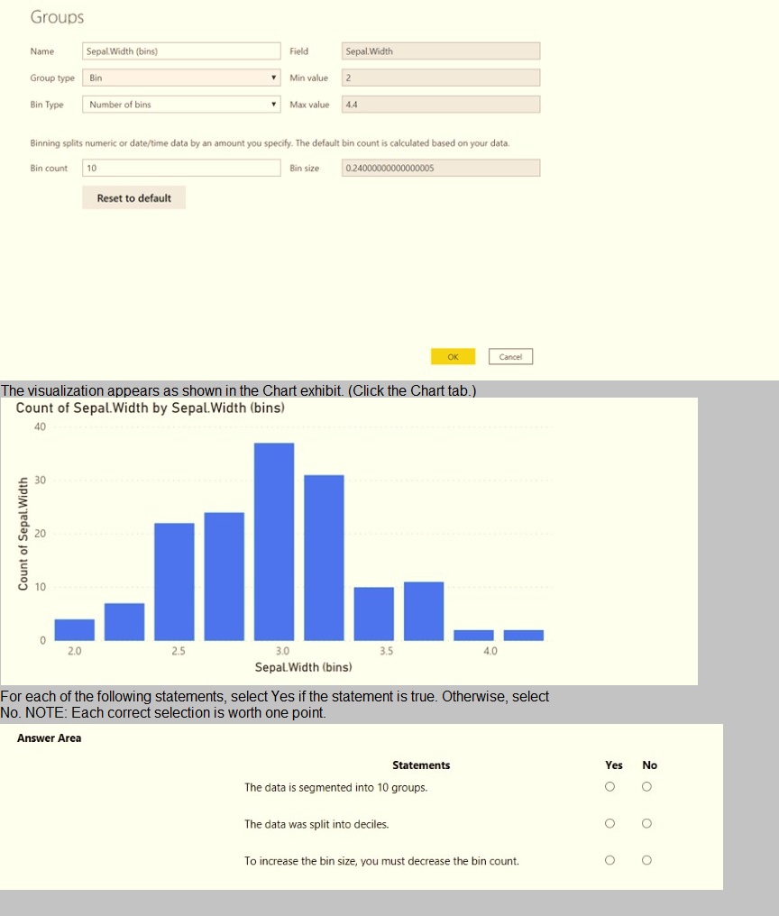
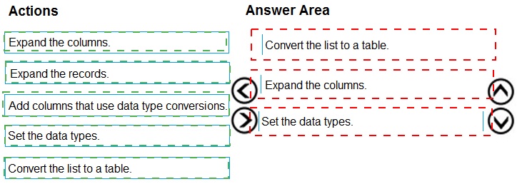
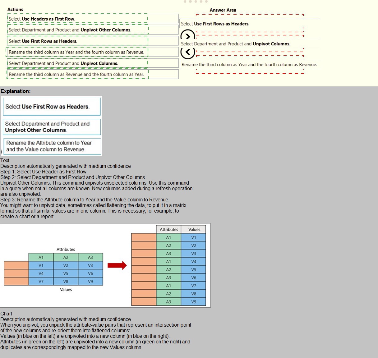
You are building a dataset from a JSON file that contains an array of documents.
You need to import attributes as columns from all the documents in the JSON file. The solution must ensure that date attributes can be used as date hierarchies in Microsoft Power BI reports.Which three actions should you perform in sequence? To answer, move the appropriate actions from the list of actions to the answer area and arrange them in the correct order.
You embed a Power BI report in a Microsoft SharePoint Online page.
A user name User1 can access the SharePoint Online page, but the Power BI web part
displays the following error message: “This content isn’t available”.
User1 is unable to view the report.
You verify that you can access the SharePoint Online page and that the Power BI report
displays as expected.
You need to ensure that User1 can view the report form SharePoint Online.
What should you do?
A.
Publish the app workspace.
B.
Edit the settings of the Power BI web part.
C.
Modify the members of the app workplace.
D.
Share the dashboards in the app workspace.
Modify the members of the app workplace.
Explanation:
References: https://docs.microsoft.com/en-us/power-bi/service-embed-report-spo
You have the following table named Location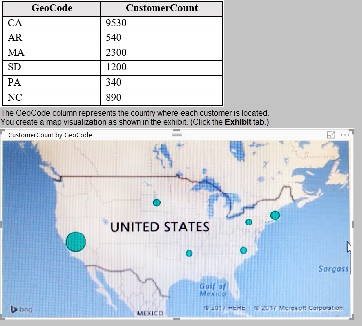
You need to ensure that the map displays the country locations.
What should you do?
A.
Replace the values in the GeoCode column with postal codes or zip codes.
B.
Change the name of the GeoCode column to Country.
C.
Change the name of the Location table to Country.
D.
Change the Default Summarization of the GeoCode column.
E.
Add a Geoportal column to the Location table.
F.
Change the Data Type of the GeoCode column.
Change the name of the GeoCode column to Country.
Explanation:
References:
https://docs.microsoft.com/en-us/power-bi/visuals/power-bi-map-tips-and-tricks
Your company plans to completely separate development and production assets such as
datasets, reports, and dashboards in Microsoft Power BI.
You need to recommend an application lifecycle strategy. The solution must minimize
access to production assets and prevent end users from viewing the development assets.
What should you recommend?
A.
Create production reports in a separate workspace that uses a shared dataset from the development workspace. Grant the end users access to the production workspace.
B.
Create one workspace for development. From the new workspace, publish an app for production.
C.
Create a workspace for development and a workspace for production. From the production workspace, publish an app.
D.
In one workspace, create separate copies of the assets and append DEV to the names of the copied assets. Grant the end users access to the workspace.
Create a workspace for development and a workspace for production. From the production workspace, publish an app.
Explanation:
Use different work stages (Development, Test, and Production).
Deploy from the Development workspace.
Reference:
https://visualbi.com/blogs/microsoft/powerbi/application-lifecycle-management-power-bi/
You receive revenue data that must be included in Microsoft Power Bl reports.
You perform an initial load of the data from a Microsoft Excel source as shown in the following exhibit.
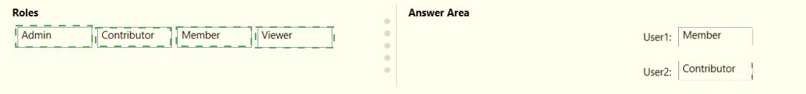
You have a Microsoft Power Bl workspace.
You need to grant the user capabilities shown in the following table.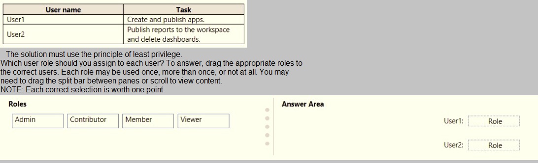
| Page 11 out of 25 Pages |
| Previous |