Topic 4, Misc. Questions
You have a Microsoft Power Bl dashboard. The report used to create the dashboard uses an imported dataset from a Microsoft SQL Server data source. The dashboard is shown in the exhibit. (Click the Exhibit tab.)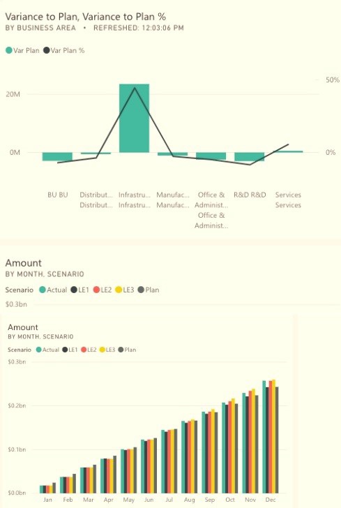
What occurred at 12:03:06 PM?
A.
A user pressed F5
B.
A new transaction was added to the data source.
C.
A user added a comment to a tile.
D.
The dashboard tile cache refreshed
The dashboard tile cache refreshed
Reference:
https://docs.microsoft.com/en-us/power-bi/connect-data/refresh-data
Note: This question is part of a series of questions that present the same scenario.
Each question in the series contains a unique solution that might meet the stated
goals. Some question sets might have more than one correct solution, while others
might not have a correct solution.
After you answer a question in this scenario, you will NOT be able to return to it. As
a result, these questions will not appear in the review screen.
You have a clustered bar chart that contains a measure named Salary as the value and a
field named Employee as the axis. Salary is present in the data as numerical amount
representing US dollars.
You need to create a reference line to show which employees are above the median
salary.
Solution: You create an average line by using the Salary measure.
Does this meet the goal?
A.
Yes
B.
No
No
Explanation:
Instead create a percentile line by using the Salary measure and set the percentile to 50%.
Note: The 50th percentile is also known as the median or middle value where 50 percent of
observations fall below.Reference:
https://dash-intel.com/powerbi/statistical_functions_percentile.php
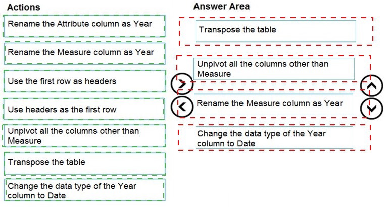
You are creating a Microsoft Power BI data model that has the tables shown in the following table.
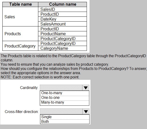
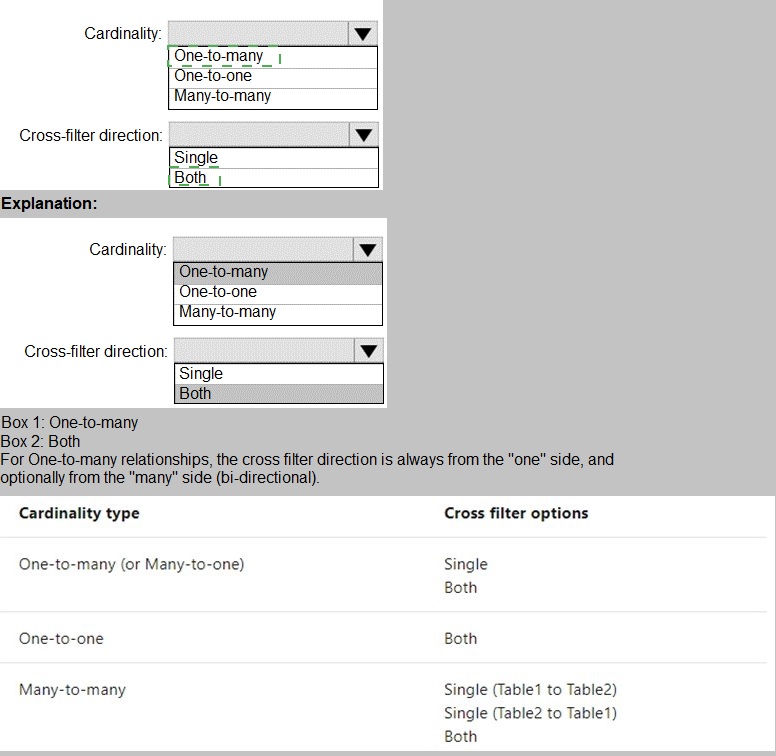
You have a Power BI model that has the following tables:
Product (Product_id, Product_Name)
Sales (Order_id, Order_Date, Product_id, Salesperson_id, Sales_Amount)
Salesperson (Salesperson_id, Salesperson_name, address)
You plan to create the following measure.
Measure1 = DISTINCTCOUNT(Sales[ProductID])
You need to create the following relationships:
Sales to Product
Sales to Salesperson
The solution must ensure that you can use Measure1 to display the count of products sold
by each salesperson.
How should you configure the relationships? To answer, select the appropriate options in
the answer area.
NOTE: Each correct selection is worth one point.
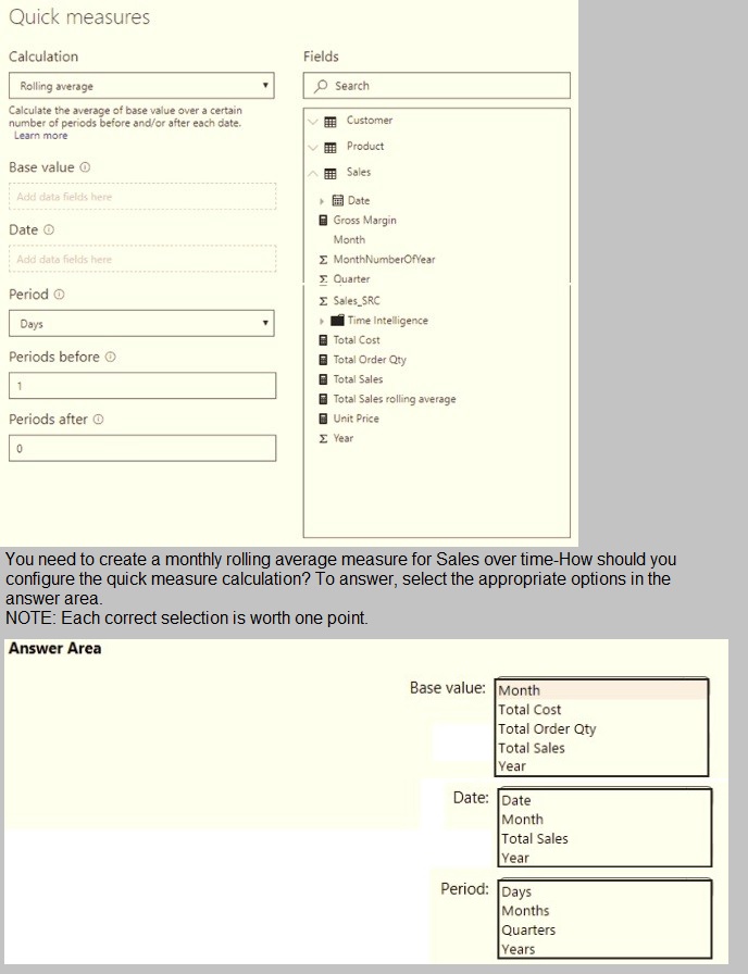
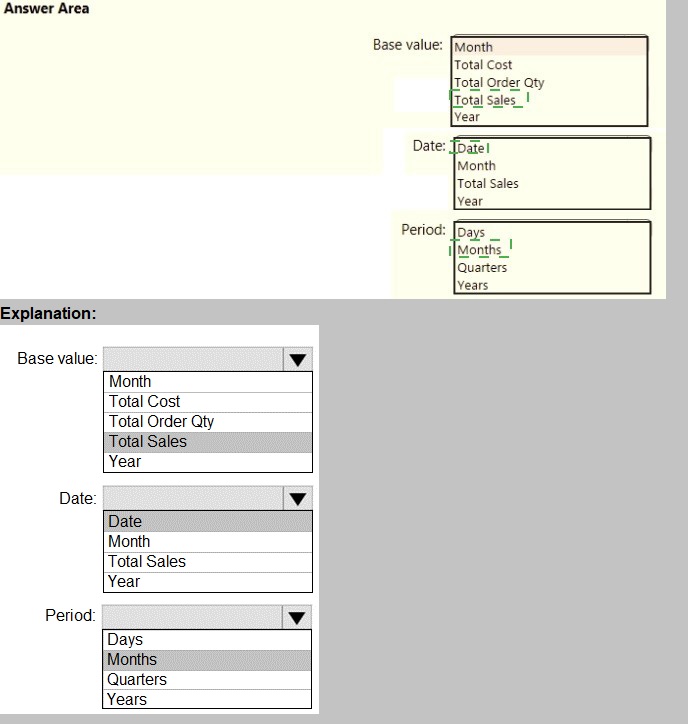
You are creating a quick measure as shown in the following exhibit.
You are preparing a financial report in Power BI.
You connect to the data stored in a Microsoft Excel spreadsheet by using Power Query Editor as shown in the following exhibit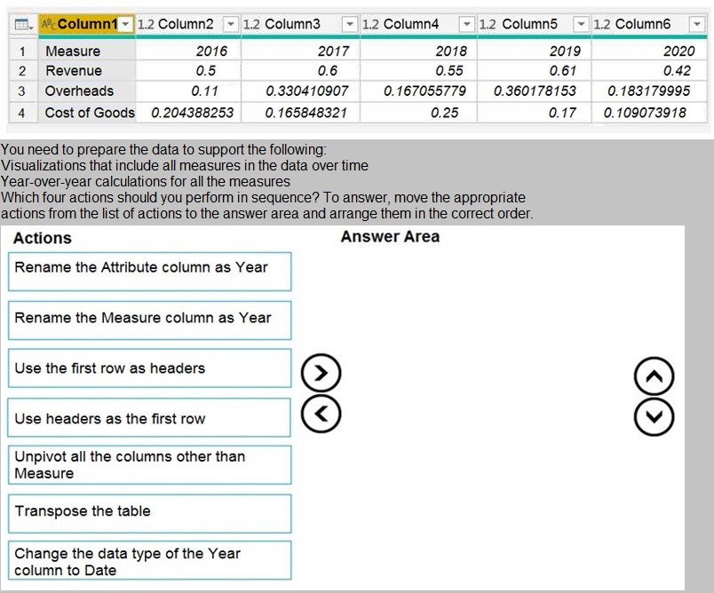
Note: This question is part of a series of questions that present the same scenario.
Each question in the series contains a unique solution that might meet the stated
goals. Some question sets might have more than one correct solution, while others
might not have a correct solution.
After you answer a question in this scenario, you will NOT be able to return to it. As
a result, these questions will not appear in the review screen.
You have a clustered bar chart that contains a measure named Salary as the value and a
field named Employee as the axis. Salary is present in the data as numerical amount
representing US dollars.
You need to create a reference line to show which employees are above the median
salary.
Solution: You create a percentile line by using the Salary measure and set the percentile to
50%.
Does this meet the goal?
A.
Yes
B.
No
Yes
Explanation:
The 50th percentile is also known as the median or middle value where 50 percent of
observations fall below.
Reference:
https://dash-intel.com/powerbi/statistical_functions_percentile.php
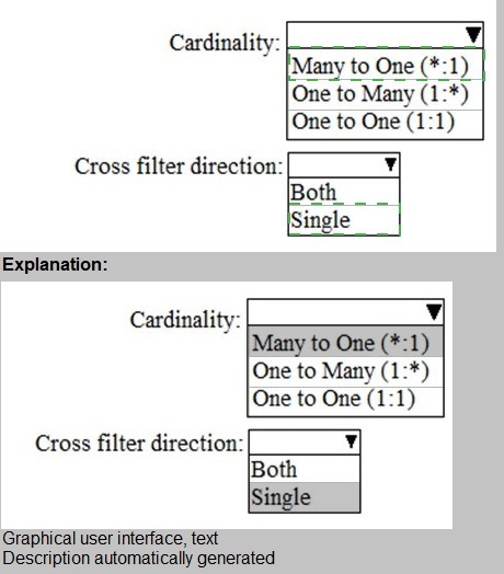
You build a report to analyze customer transactions from a database that contains the tables shown in the following table.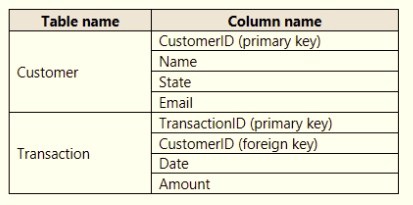
You import the tables.
Which relationship should you use to link the tables?
A.
one-to-many from Customer to Transaction
B.
one-to-one between Customer and Transaction
C.
one-to-many from Transaction to Customer
D.
many-to-many between Customer and Transaction
one-to-many from Customer to Transaction
Explanation:
Each customer can have many transactions.
For each transaction there is exactly one customer.
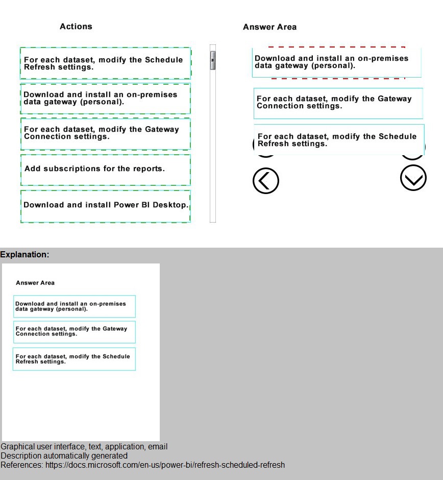
You have a Microsoft Excel workbook that contains two tables.
From Power BI, you create a dashboard that displays data from the tables.
You update the tables each day.
You need to ensure that the virtualizations in the dashboard are updated daily.
Which three actions should you perform in sequence? To answer, move the appropriate
actions from the list of actions to answer area and arrange them in the correct order
Note: This question is part of a series of questions that present the same scenario.
Each question in the series contains a unique solution that might meet the stated
goals. Some question sets might have more than one correct solution, while others
might not have a correct solution.
After you answer a question in this scenario, you will NOT be able to return to it. As
a result, these questions will not appear in the review screen.
You have several reports and dashboards in a workspace.
You need to grant all organizational users read access to a dashboard and several reports.
Solution: You create an Azure Active Directory group that contains all the users. You share
each report and dashboard to the group.
Does this meet the goal?
A.
Yes
B.
No
Yes
Explanation:
Statements and questions are tricky and confusing. When the access is granted for the
group (all users) for ALL (each) dashboards and ALL (each) reports in the workspace, then
the will have read access to the specific (A, one) Dashboard and several reports, because
they are part of all dashboards and reports. There is no statement, that for the other
dashboards (except the one) and the other reports (except the several) that access must
be prevented. They are also accessible (maybe it is not desired but not stated here).
You have a Microsoft Power Bl dashboard.
You need to ensure that consumers of the dashboard can give you feedback that will be visible to the other consumers of the dashboard.
What should you use?
A.
Feedback
B.
Subscribe
C.
Comments
D.
Mark as favorite
Comments
Explanation: https://docs.microsoft.com/en-us/power-bi/consumer/end-user-comment
You have the visual shown in the exhibit. (Click the Exhibit tab.)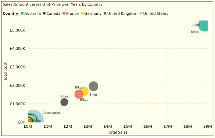
You need to show the relationship between Total Cost and Total Sales over time.
What should you do?
A.
Add a play axis.
B.
Add a slicer for the year.
C.
From the Analytics pane, add an Average line.
D.
Create a DAX measure that calculates year-over-year growth.
Add a play axis.
Explanation:
You can set up a date field in play axis, and then scatter chart will animate how measure
values are compared to each other in each point of a time.
Reference:
https://radacad.com/storytelling-with-power-bi-scatter-chart
| Page 10 out of 25 Pages |
| Previous |